0 members and 7,804 guests
No Members online

» Site Navigation

» Stats
Members: 35,443
Threads: 103,072
Posts: 826,684
Top Poster: cc.RadillacVIII (7,429)
|
-
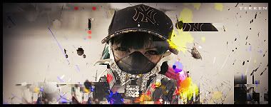
 latest, colour splatter sig latest, colour splatter sig
i was following tut Fork linked, but kinda went my own way. CnC

EDIt:i got rid of the bar code. V2:
EDIT: Any better?
v3

v4

Last edited by tekken; 11-29-2008 at 09:29 AM.
Reason: replying to comments
-
can i see the original stock please?
-
-
all abit random doesnt really havent got any flow but its creative ive gotta say, maybe get rid of the barcode or make it all sameller and put it further down and left  overall pretty nice but chaotic and random sig overall pretty nice but chaotic and random sig
-
yeah the barcode doesnt fit, maybe some sort of splatter text idk, to go along with the splatter chaotic theme
-
ok, ill try that and see.
gonna edit the post.
-
nice try, but the colors and the sig does not go together. Need better balance with the sig. Nice try tho.
-
 Originally Posted by xJTRx

nice try, but the colors and the sig does not go together
i wanted it to sem like someone is just throwing paint ballons at it and for it to have lots of different colours.
-
i think the variety of colours look nice and go well with the theme of the sig
-
This is a decent sig but the text is horrible. V1: use default fonts. Barcodes are not default and it really doesnt help the blending at all. V2: I like the font looks good not quite default but doesn't stand out too much. WHy is it in the corner. Thats telling me you aren't comfortable with your text abilities and automatically draws my eye away from the sig. You've seen the sandwhich anaolgie right? Same thing.
I liek the clipping masks and i like the colors.
I just wish there was more in the BG rather thasn just blurring. It doesn't rly look good depth wise when everything is blurry.
 My DevART
RATCHET is my bitch
Andrew says:
u ever stolen a bible?
Apathy says:
no
used the last two pages to roll a joint though
Andrew says:
wow
thats fucking hard core
^^HAHAHA, dm sucks XD
Similar Threads
-
By john316 in forum Resources
Replies: 0
Last Post: 07-23-2008, 01:13 PM
-
By LPKoRnA7X in forum Sigs & Manips
Replies: 2
Last Post: 09-29-2007, 12:48 PM
-
By ike32mike in forum Support
Replies: 6
Last Post: 07-26-2007, 03:58 PM
-
By Spluff in forum Digital Art
Replies: 2
Last Post: 12-03-2005, 10:08 PM
-
By rchocobo in forum Sigs & Manips
Replies: 2
Last Post: 06-26-2005, 02:25 AM
 Posting Permissions
- You may not post new threads
- You may not post replies
- You may not post attachments
- You may not edit your posts
-
Forum Rules
|


 Reply With Quote


