0 members and 6,712 guests
No Members online

» Site Navigation

» Stats
Members: 35,443
Threads: 103,072
Posts: 826,684
Top Poster: cc.RadillacVIII (7,429)
|
-
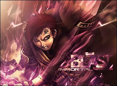
 Blast Blast
Well, I'm continuing on with my flame, and tried it out again...just trying new stuff...I personally like this one. What you guys think?
Last edited by Immortal.; 11-29-2008 at 08:08 PM.
-
its nice, i like the colour one, ur getting better at that fire thing . .
-
it's a good sig, love what you did with the text, but the left side throws the flow off. Also try blending the c4d a bit more ;p good stuff tho mate.
-
awesome man, love it. though imo the left side could use bit of darkening/purple coloring (except for the lightsource). Also it seems like there are two lightsources, one from the top left and one from the bottom left
other than that nice job
ooo and i forgot to say: I LOVE THE FLAME EFFECT.
Last edited by Miril; 11-29-2008 at 06:22 PM.

Et Tu?
SilentShadow | Jorrne | Arcmenis | Garis | Splinter | Sanbu | DeadlesS | Tekken | Proflax | Suddu
-
-
Your left side is messing up the flow. Try to liquify it with an upper right flow. Otherwise very nice. 

"Judge a man by his questions,
not his answers."
-Voltaire
-
wow... I love it, the flow and how the colors blend.
Veeery good, maybe the left side should be darkened or liquified outwards.
Current

-
-
THis is HUGE! i like the sizing but does it really have to be so big lol. It's like to big to be physically used as a sig.
Nice lighting in V2. The colroing is rly mono though i dislike that. YOu mastered coloring on your GOW tag so do it heasr too.
Text is pretty good but it'd be betetr without the clipping mask.
Great flow it's rly fantastic.
DOn't start getting in a habbit of using this flame effect it's cool but it's not that unique.
 My DevART
RATCHET is my bitch
Andrew says:
u ever stolen a bible?
Apathy says:
no
used the last two pages to roll a joint though
Andrew says:
wow
thats fucking hard core
^^HAHAHA, dm sucks XD
-
 Originally Posted by Papa

Text is pretty good but it'd be betetr without the clipping mask.
Maybe if you use a 1px stroke around the text it would work with the clipping mask, as it is I agree with papa
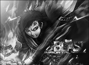
my favorite is the b/w one it really brings out the lighting
-
hey hey hey
looks great.
since i haven't been here for some time you improved I should say 
Similar Threads
-
By .heKtik in forum Digital Art
Replies: 3
Last Post: 01-04-2007, 12:58 AM
-
By VolantKnave in forum Digital Art
Replies: 6
Last Post: 07-22-2006, 11:06 AM
-
By imported_forgotten in forum Digital Art
Replies: 1
Last Post: 02-17-2006, 01:26 AM
-
By DragonsRage in forum Digital Art
Replies: 4
Last Post: 09-10-2005, 05:18 AM
-
By BeyondDeWood in forum Digital Art
Replies: 2
Last Post: 08-03-2005, 05:12 PM
 Posting Permissions
- You may not post new threads
- You may not post replies
- You may not post attachments
- You may not edit your posts
-
Forum Rules
|


 Reply With Quote


