0 members and 512 guests
No Members online

» Site Navigation

» Stats
Members: 35,443
Threads: 103,072
Posts: 826,684
Top Poster: cc.RadillacVIII (7,429)
|
-
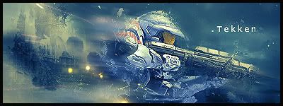
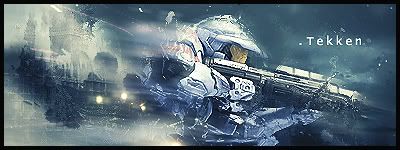
 Halo Halo
just finished making them. i prefer v2 my self what about you guys?
V1
V2
-
like the flow,U have learned a lot!!
V2,FTW..Fix the text please

Go GFX viod!
-
The text would look better if it would be a dark blue
And it's a little oversharpend
-
Clear up master chief a bit its too busy over him
-
V2!!! ftw.
I agree fix the text. HIt it up with some garamond on a tiny setting and space all the text out by like 200.
ohh that'll look hot.
I love the effects on this and the BG is hot. SIck job tekken you nailed it.
 My DevART
RATCHET is my bitch
Andrew says:
u ever stolen a bible?
Apathy says:
no
used the last two pages to roll a joint though
Andrew says:
wow
thats fucking hard core
^^HAHAHA, dm sucks XD
-
thanks alot guys, ill fix up the text. i tried not to blurr it alot, but i used motion blur to keep the flow going but not cover the BG.
EDIT:

changed font
Last edited by tekken; 11-30-2008 at 11:10 AM.
Similar Threads
-
By Papa in forum Sigs & Manips
Replies: 6
Last Post: 06-15-2007, 12:19 AM
-
By s0ggywaffls in forum Sigs & Manips
Replies: 3
Last Post: 06-12-2007, 07:28 PM
-
By .blueflare in forum Digital Art
Replies: 6
Last Post: 05-15-2006, 01:54 AM
-
By rabies =0 in forum Sigs & Manips
Replies: 2
Last Post: 05-13-2006, 09:27 PM
 Posting Permissions
- You may not post new threads
- You may not post replies
- You may not post attachments
- You may not edit your posts
-
Forum Rules
|


 Reply With Quote


