0 members and 2,746 guests
No Members online

» Site Navigation

» Stats
Members: 35,443
Threads: 103,072
Posts: 826,684
Top Poster: cc.RadillacVIII (7,429)
|
-
-

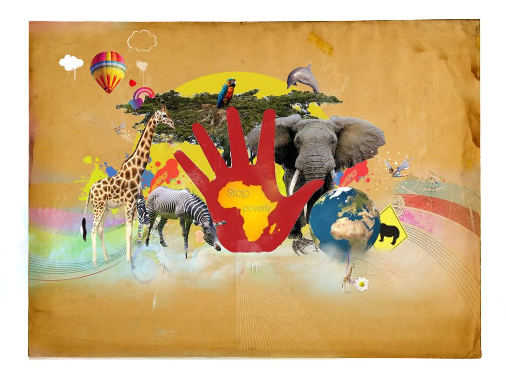
Right suddu your not listening.
Your lps seem very random do not add loads of stocks, try to pick a few meaningful ones and use them, enhance them and add effects.
-
-
 Originally Posted by ratchetnclank

Right suddu your not listening.
Your lps seem very random do not add loads of stocks, try to pick a few meaningful ones and use them, enhance them and add effects.
lol for real son. Haha that first part made me laugh.
OKay suddu. look at Henry's old photo manips. They look like the style your trying to achive. His crime LP is awesome.:
http://www.henryamistadi.deviantart.com/
Look at how he does it and then try to mimic some of the technique. The biggest thing you need to work on is the flow, and not making so many thigns random.
ANother great way to study this is going to dev art and browsing.
 My DevART
RATCHET is my bitch
Andrew says:
u ever stolen a bible?
Apathy says:
no
used the last two pages to roll a joint though
Andrew says:
wow
thats fucking hard core
^^HAHAHA, dm sucks XD
-
-
You have the skill, just need a little practice with composition as you noticed.
The piece looks nice and everything, but when working with your stocks try to get them all with a similar level of contrast, brightness, and sharpness. Just simply apply image->adjustments->(curves, brightness and contrast, levels etc) as well as sharpening up your stocks.
As mentioned, more = not always better.
Infact, less is more.
As for "specific" things about the piece, the lines disappear on the right of the elephant, the Earth is missing a bottom part, and the bottom of the image in general looks a little unrefined.
However i love the bg lines, and the bg itself. The composition of the stocks is nice, just a little too much. The cartoony clouds are a nice touch and contrast also 
In short - Simplify! 
-
I think the text needs to be stronger
Similar Threads
-
By Virtue in forum Digital Art
Replies: 2
Last Post: 03-14-2007, 11:31 AM
 Posting Permissions
- You may not post new threads
- You may not post replies
- You may not post attachments
- You may not edit your posts
-
Forum Rules
|


 Reply With Quote


