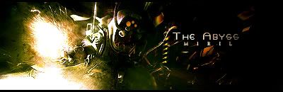
tried to take a little more time in doing this one, i never seem to be able to spend more than an hour at most doing a sig. but here it is, in all its blurriness and emptiness... i would love topaz right about now.
v1:
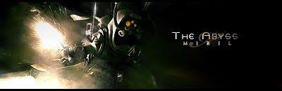
v2:
C&C / Rate Pwetty Pwease
edit: woops i did forget a border, I'll put that in shortly: I put the border in.


 Reply With Quote