0 members and 436 guests
No Members online

» Site Navigation

» Stats
Members: 35,443
Threads: 103,072
Posts: 826,684
Top Poster: cc.RadillacVIII (7,429)
|
-
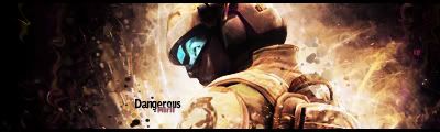
 Dangerous Dangerous

followed an older tut by rachet, C&C please.
just glanced at it in ps again and thought maybe i could get the text a little better... I dunno, I think I might like it the first way better but:
Text v2:
Last edited by Miril; 12-13-2008 at 07:11 PM.

Et Tu?
SilentShadow | Jorrne | Arcmenis | Garis | Splinter | Sanbu | DeadlesS | Tekken | Proflax | Suddu
-
-
love it, it's the army of two tut <3 that tut
but it looks like you added a bit more which is nice
-
thanks 
i'll add my sotw entry too, sorta follows the same style since i just did the Dangerous one, C&C this too please XD
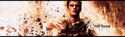
edit: Hey would you lookie there, I wasn't too late... it's saturday (well, not anymore). I KNEW THAT.
Last edited by Miril; 12-13-2008 at 10:26 PM.
Et Tu?
SilentShadow | Jorrne | Arcmenis | Garis | Splinter | Sanbu | DeadlesS | Tekken | Proflax | Suddu
-
-
 Originally Posted by Miril

followed an older tut by rachet, C&C please.
just glanced at it in ps again and thought maybe i could get the text a little better... I dunno, I think I might like it the first way better but:
Text v2:
great blending, maybe the text needs work, because it's hard to read, and kinda dark, change that, and you'll have an very solid tag.
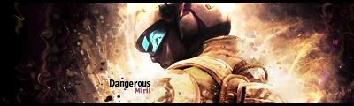
Current

-
-
Prince of persia tut right?
Decent result just render needs a tad more blending.
-
It was your assassins creed video tut xDD thanks for the c&c, I just woke up so I'm gonna do a few things then work on it.
Et Tu?
SilentShadow | Jorrne | Arcmenis | Garis | Splinter | Sanbu | DeadlesS | Tekken | Proflax | Suddu
-
-
THe blue + orange combo works rly nicely, good pcik for that.
The BG looks pretty nice, i liek the effects, but i see no bledning. I see all of his sides easily. Blend it together better, and add some depth.
Also you need to add a lightsource. You can clearly see shadows all over him so add a strong lightsource in the top left area.
The text is nice oyu did good on that.
IMO this style is really whored and im tired of seeing it. Not a unique sig in any way. But decent result.
 My DevART
RATCHET is my bitch
Andrew says:
u ever stolen a bible?
Apathy says:
no
used the last two pages to roll a joint though
Andrew says:
wow
thats fucking hard core
^^HAHAHA, dm sucks XD
-
Thanks for the c&c :3 I added in a lightsource though I'm not a gigantic fan of gigantic lightsources so they're kinda small... :\ I tried to add some depth via gradient map + blurring and smudged some of his sides out a bit
Papa: yeah, it is a whored style.... :P I dunno though, I like it xD
I'm a sucker for all things smudge.
Et Tu?
SilentShadow | Jorrne | Arcmenis | Garis | Splinter | Sanbu | DeadlesS | Tekken | Proflax | Suddu
-
Similar Threads
-
By Studhorse in forum Sigs & Manips
Replies: 7
Last Post: 01-11-2008, 07:53 PM
-
By Chemical in forum Sigs & Manips
Replies: 11
Last Post: 06-22-2005, 10:37 AM
 Posting Permissions
- You may not post new threads
- You may not post replies
- You may not post attachments
- You may not edit your posts
-
Forum Rules
|


 Reply With Quote


