0 members and 4,590 guests
No Members online

» Site Navigation

» Stats

Members: 35,443
Threads: 103,072
Posts: 826,684
Top Poster: cc.RadillacVIII (7,429)
|
-
 poka dots. poka dots.

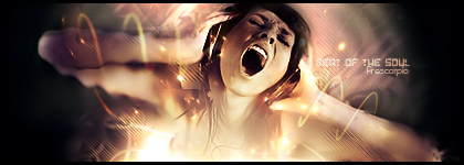
a mix of styles from me. Tell me what u think.
 My DevART
RATCHET is my bitch
Andrew says:
u ever stolen a bible?
Apathy says:
no
used the last two pages to roll a joint though
Andrew says:
wow
thats fucking hard core
^^HAHAHA, dm sucks XD
-

hmmm very similar to ur other one.
i like the colours def.
like the colours..
ur style is very defined...looking pretty nice.
hmmm i tink it could use a border?
but that's it...amazing stuff.
-

I think its awesome... seeing a lot of good sigs tonight. Her arm does seem a bit thin though cause of the splatter/clipping masks (whatever you did there...) imo, but that shouldn't be fixed cause it looks too awesomeness there :P Otherwise its nice, maybe fill up the left side with something/crop it.
good job

Et Tu?
SilentShadow | Jorrne | Arcmenis | Garis | Splinter | Sanbu | DeadlesS | Tekken | Proflax | Suddu
-
-

in my very my very honest opinion we all now its papa and regardless of that no need to fear to be xD truthful to him, he is normally giving serious CnC's to everyone we should as well
so calling it right out the bat amazing is either sucking up a bit for being papa or being opinion biased, because we normally get amazing stuff from him
having said that i do like the concept and the color scheme allthough compared to any other work from yours it way below your average quality, it lacks a bit of flow since the change or transition to one state to the other is pretty much too abrupt to make the eye flow about. left side is completely empty and makes the sig feel a bit dull unfinished.
your tezt placement and selection is always awsome but on this one is almost too hard to read. it lacks depth imo
the effects are nice and the idea is cool as well maybe workign a bit more on this one can bring it out, atm it feels more like a concept in work than an actuall sig to me
newest:

Fav :

The true and only Firescorpio!
(no autographs please)
-

my c&c was very opinion based, firescorpio, and I probably should've taken more time on it, I was in a rush getting called down to grab my dinner before it got cold.
the depth is a bit of a problem now that i look at it again, imo it's because of the skinny arm i mentioned. the color change is abrupt as you mentioned, but also imo i like it better that way.
as i said my c&c was opinion based and just glancing at it i found very few things wrong with it. i'll try and make meh c&c a little more helpful in the future :P soz

Et Tu?
SilentShadow | Jorrne | Arcmenis | Garis | Splinter | Sanbu | DeadlesS | Tekken | Proflax | Suddu
-
-

i like it, kept it simple. Colors hot as always.Compo, flow is on there. But could use a bit more depth  (i like depth shush) Awesome sig overall imo. (i like depth shush) Awesome sig overall imo.
-
-
-

i think i'm biased as fire sed
-
 Posting Permissions
- You may not post new threads
- You may not post replies
- You may not post attachments
- You may not edit your posts
-
Forum Rules
|

