0 members and 4,816 guests
No Members online

» Site Navigation

» Stats
Members: 35,443
Threads: 103,072
Posts: 826,684
Top Poster: cc.RadillacVIII (7,429)
|
-
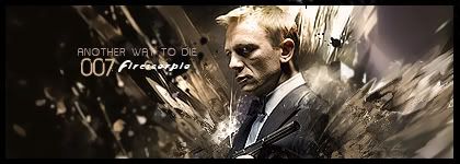
 007 007
well i was also working on a sig on 007 =P trying to be more versatile with my style trying to keep it so that ppl know its me but i am trying to vary around with it still very choppy =P but i guess its a start CnC pls
(i guess this one is ok not to happy with the end result but still)
newest:

Fav :

The true and only Firescorpio!
(no autographs please)
-
Damn, freaking amazing! Really love the c4d's effect only bad part i see is that the "firescorpio" font could be better. But thats amazing.
-
only problem i see is depth, it doesn't feel like a realistic depth
-
try to blur at the side of the c4ds and i dont like the Firescorpio text try to do the same text effect as the other . and over its nice O_o
-
 Originally Posted by Firescorpio

well i was also working on a sig on 007 =P trying to be more versatile with my style trying to keep it so that ppl know its me but i am trying to vary around with it still very choppy =P but i guess its a start CnC pls
(i guess this one is ok not to happy with the end result but still)
where to start...damm.
starting off the effects are hopt. the text is well done too.
colours a bit muted..but me i prefer contrast...matter of opinion.
it suits bond soo well.
lighting is good too.
overall great tag. i like it..doesn't matter if u dont.
-
very good but needs something more
My Newest
Making A Tutorial: Off Mail me if you wanna collaberate.
-
-
Originally Posted by Aces High
. Right now it's like, "I'm firescorpio with a sweet tag but I'm goofy so I used a cousin of comic sans for my name."  . Actually it's not that bad, but it definitely needs work.
haha, i was gonna say that too.
El fire, we know it's you because your the only person i know that would put their name in comic sans on a sexy sig like that.
It's an awesome sig, but the way you blended the c4d's bothers me. You didn't really blend them into bond you just kinda ended them somewhere on his jacket. you need to bring that all the way down to the bottom of the sig that way it blends better or cut it off behind his jacket, but pick one cause rigth now it looks really half assed.
Lighting is nice thougha dnt he black on the left side givies it that gold and sexy look.
But why blur it so much? I know you know about depth of feild so why did you blur it so close to bond? it doesn't make sense. Just cause its a sig don't abandon what you learned at gfx school and coca cola. Use it, most kids on here would kill for that knowledge.
Teh another way to die font is okay but i wouldhave prefered a pixel font most defitnly, it would have flowed better with the 007 font.
And the whoel firescropio part..well i covered that before.
On a last note his blue tie doesn't go with the purple in the bg. I'd switch the color on that, pay attention to the details.
it's a decent tag but..as it is a new style you need time to finnesse it.
 My DevART
RATCHET is my bitch
Andrew says:
u ever stolen a bible?
Apathy says:
no
used the last two pages to roll a joint though
Andrew says:
wow
thats fucking hard core
^^HAHAHA, dm sucks XD
-
heheeh thnks for the CnC guys and actually the Firescorpio text wast just xD to see if you guys got the joke xD most of u got it think xD
as for what papa said yeah i think im not paying attention to other details i normally would for work or any project on school =P i'll work on the details and post a V2 as soon as i get back home right now im on our holiday house for the 24th family reunion and stuffz @--@ xD
edit:
lol fux that xD photoshop 7 ftfw XD
couldn't do much bout the c4d's since i edited xD the image i linked on teh forums lol =P
v2

Last edited by Firescorpio; 12-20-2008 at 02:01 PM.
newest:
Fav :
The true and only Firescorpio!
(no autographs please)
-
v2 text is even worse.
Hurts my eyes XD
 Posting Permissions
- You may not post new threads
- You may not post replies
- You may not post attachments
- You may not edit your posts
-
Forum Rules
|


 Reply With Quote