GFXVoid Graphic Design Forum

Remove Text Formatting
Loading...

» Online Users: 2,182

0 members and 2,182 guests
No Members online

» Site Navigation

 > FAQ

» Stats

Members: 35,443
Threads: 103,072
Posts: 826,684
Top Poster: cc.RadillacVIII (7,429)
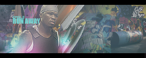
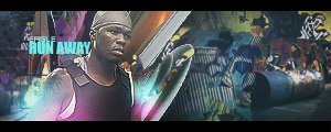
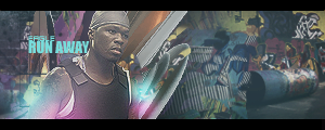
Welcome to our newest member, Lekelindids
Results 1 to 9 of 9

Thread: Run Away

  1. #1
    Join Date
    Apr 2008
    Posts
    208

    Default Run Away


    YAY colors
    Last edited by eagles16; 12-21-2008 at 04:12 PM.

  2. #2
    Join Date
    Dec 2008
    Posts
    22

    Default

    Hey that's really cool, the only part I don't like is that it looks a little foggy, so add saturation and decrease the gray overlay so the colors look more vibrant.

  3. #3
    Join Date
    Apr 2008
    Posts
    208

    Default

    k postin up v2 and v3


  4. #4
    Join Date
    Jul 2008
    Location
    Manchester, England
    Posts
    929

    Default

    V3 is vbest but the C4d next to him is to sharp and you should try and blend 50 abit more :Smaybe move him further right aswell he is to far left and the right has nothing in it except like a barrell lol other than that its an nice tag i like the light sources and the text but maybe do a little clipping mask on the Run Away text


  5. #5
    Join Date
    Apr 2008
    Posts
    208

    Default

    k ill put clip mask on the text.

  6. #6
    Join Date
    Jun 2008
    Location
    B-Town, IN
    Posts
    320

    Default

    I agree about the c4d but not about the right side. There's some sweet graffiti on the wall and that adds to the urban feel, so imo i would leave him where he is. Outside of that, sweet color work and nice job overall!


    "You want a piece of Uncle?" - Uncle, Jackie Chan Adventures

  7. #7
    Join Date
    Jan 2007
    Location
    Minnesota
    Posts
    5,091

    Default

    V2 FTW!!! I love this sig man. It is really really hot. That graffitti is sickly and the BG goes amazingly with 50. THE c4d's work wella nd everything blends. You did a sick silly job!


    My DevART
    RATCHET is my bitch
    Andrew says:
    u ever stolen a bible?
    Apathy says:
    no
    used the last two pages to roll a joint though
    Andrew says:
    wow
    thats fucking hard core
    ^^HAHAHA, dm sucks XD


  8. #8
    Join Date
    Apr 2008
    Posts
    208

    Default

    thanks papa

    and the left side isn't even a graffiti stock
    its a brick wall with clipping masks of the graffitti

  9. #9
    Join Date
    Jul 2008
    Location
    Vancity, Canada
    Posts
    2,985

    Default

    Haha well you blew Papa right out of the water, thats usually really good.
    I love it too, V2 and V3 are the best in my eyes.
    Awesome colours, good lighting, blending is alright.
    Text kind of messes it up for me, I would have liked to see more of a graffiti font, but thats fine.
    A bit empty on the far side but I can see the work you did so thatst good.
    Really liking this one.
    Quote Originally Posted by MarkPancake View Post
    MarkPancake banned.
    Success.

Posting Permissions

  • You may not post new threads
  • You may not post replies
  • You may not post attachments
  • You may not edit your posts
  •  
Powered by vBadvanced CMPS v4.1.1