0 members and 755 guests
No Members online

» Site Navigation

» Stats
Members: 35,443
Threads: 103,072
Posts: 826,684
Top Poster: cc.RadillacVIII (7,429)
|
-
 < Something > < Something >
< Something >
It's been a long time since the last time I shared my work here hehe, just made a sig today. I focused on the simplicity of the effects and make a feel of something I dunno lol.
Well anyway here, Sig version.
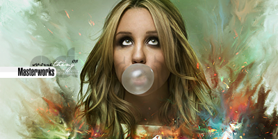
Larger version.

Just tried making again sigs to practice effect transitions after months with web designs ^^

 Proud
Proud Member Of MasterWorks® Family
-
Really tight effects.
Love the colours.
Awesome text and text logo.
Unfortunately you suffer from FHS, as named by Papa.
Floating Head Syndrome, she is cut off from the neck.
Basically everything is good in my eyes, nice depth and some good concept, but her head has been severed. :P
 Originally Posted by MarkPancake

MarkPancake banned.
Success.
-
-
Well it's kind of cut off from the neck, just looks a bit weird to me, it would flow better if it went all the way to the bottom. :P
Originally Posted by MarkPancake
MarkPancake banned.
Success.
-
-
don't worry, I'm doctor FHS and i've experianced many cases like yours, i'm sorry their is no cure, except for maybe resizing the render a bit,
don't worry it's not deadly disease,
thank and good night,
-
KK so it's been awhile kira, where you been? We need you here.
Anyways TBH i think this sig is really in a seperate league thasn your others, and i dont mean that in a good way. I dislike the lack of color combo a lot. Usually your ability to use every color in the rainbow on one sig helps you out a lot but IMO this time it just isn't working. You wouldhave been better off with a blue+yellow+pink or red+yellow etc. The green just does not go right IMO.
The smudging is okay but tbh it seems very flat. What snudge settings are you using? I dont know why but the wya you smduged it just bothers me. All of it kind of stops exaclty at the halfway mark.
I've seen much better from you. I don't know if it's rust from not doing gfx, or if it's just not inspiration but this one is not your usual par.
On a good note, i like the text and the quality of having it that big i very impressive. nice.
 My DevART
RATCHET is my bitch
Andrew says:
u ever stolen a bible?
Apathy says:
no
used the last two pages to roll a joint though
Andrew says:
wow
thats fucking hard core
^^HAHAHA, dm sucks XD
-
I really like the colours and effects, text is sweet as it comes and generally a decent tag. I have seen better from you though kira.
GJ
-
KIRA!
good to see you back again, love your work.
I really like this piece personally.
I think the colors are pretty good, if any 1 particular throws it off, for me, would be the blue and white near the bottom right.
keep em coming 
-
 Posting Permissions
- You may not post new threads
- You may not post replies
- You may not post attachments
- You may not edit your posts
-
Forum Rules
|


 Reply With Quote


