0 members and 5,545 guests
No Members online

» Site Navigation

» Stats
Members: 35,443
Threads: 103,072
Posts: 826,684
Top Poster: cc.RadillacVIII (7,429)
|
-
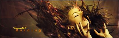
 Burning Burning
Haven't had time for the Void or gfx lately./
so i pulled up PS and gave it a run.
-
omg that sig is so wonderful :O i like it alot good job immortal
-
-
-
-
thank you every one
-
i gotta be honest thi is not ner your best at all. The c4d blending is okay, but i dislike howempty it is. Also the coloring looks a bit odd, overall i just think your pretty rusty.
 My DevART
RATCHET is my bitch
Andrew says:
u ever stolen a bible?
Apathy says:
no
used the last two pages to roll a joint though
Andrew says:
wow
thats fucking hard core
^^HAHAHA, dm sucks XD
-
I like the coloring tbh, tho I dont like the Burning text. But simple yet nice, my opinion 
~Joodi~
-
I don't like the blending of whatever the hell is coming outta her nose :|. Otherwise pretty good. Dislikes of mine is the c4d on her nose. The blending of the c4d to hte backround, looks pretty sharp there. And the text. =) <3
-
out of her nose is her hair.
its part of the stock lol
Similar Threads
-
By crazycata in forum Sigs & Manips
Replies: 7
Last Post: 10-09-2008, 11:19 PM
-
By MartinBabies in forum Digital Art
Replies: 16
Last Post: 09-19-2008, 11:18 PM
-
By Firescorpio in forum Sigs & Manips
Replies: 7
Last Post: 06-25-2008, 03:56 PM
-
By ratchetnclank in forum Sigs & Manips
Replies: 2
Last Post: 06-23-2008, 02:28 PM
-
By Light in forum Digital Art
Replies: 2
Last Post: 12-06-2006, 04:45 PM
 Posting Permissions
- You may not post new threads
- You may not post replies
- You may not post attachments
- You may not edit your posts
-
Forum Rules
|


 Reply With Quote


