0 members and 5,780 guests
No Members online

» Site Navigation

» Stats
Members: 35,443
Threads: 103,072
Posts: 826,684
Top Poster: cc.RadillacVIII (7,429)
|
-
-

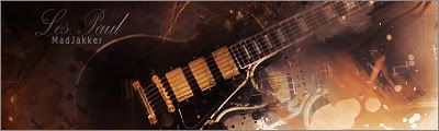
those effects are pretty freckiin schweet man. One thing... Floating head. Lightings good.. efects are pretty frekiin schweet, text is ok... not great but ok, colors mostly go together, there is definitly some flow. FLOATING. HEAD. (IMO)

Et Tu?
SilentShadow | Jorrne | Arcmenis | Garis | Splinter | Sanbu | DeadlesS | Tekken | Proflax | Suddu
-
-
i like it but it is a little overtopassed and floating head xD
Favorite:

-
i wouldnt say floating head tbh, it looks like a fluffy hood over the head :P
good job, its grreat 
-
 Originally Posted by Popje

i like it but it is a little overtopassed and floating head xD
i didn't used topaz, stock was like that
WHAT'S THIS?! A SIGNATURE?
-
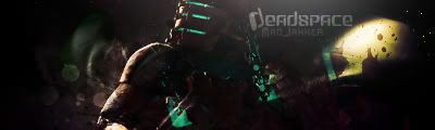
hmmm i beg to differ with the rest ad for the whole signature itself it is pretty solid and i have been watching your stuff and i can see you have most blending and effects techniques down, which is good.
im no fan of this one for start the background is completely dull and empty the redner just seems completely slapped on and makes no depth affect of all, as for the effects in the front i think they are over burned and again you took little time to blend em in im suposing they are C4D's.
text IMO doesn't fit but it was a nice attempt maybe some other place idk overall the sig compared to other stuff i have seen about you seems pretty default and lacking some work.
with more work this one could be pretty tight but right now i dont quite like it sorry flatty
newest:

Fav :

The true and only Firescorpio!
(no autographs please)
-
The effects would be badass if they where blended in more.
-
The whole floating head complaint before doesn't really apply on this sig guys. FHS is more like for smaller heads when they are just randomly slapped around. This is big and you can easily pick it out. the effects are clearly centered on it too so it's defeintly not FHS.
However The compo on this is horrible. Read the rule of thirds and follow it. You should stop placing the render in the middle, i see that happening to often at the void.
The effects are ncie but IMO that redish color don't rly belong wiht that orangey yellow brown.
not bad overall.
 My DevART
RATCHET is my bitch
Andrew says:
u ever stolen a bible?
Apathy says:
no
used the last two pages to roll a joint though
Andrew says:
wow
thats fucking hard core
^^HAHAHA, dm sucks XD
-
FHS may be a little hard to apply to this one, but imo anything without at least shoulders is FHS because then it just looks like you decapitated someone and put em in a sig.
Et Tu?
SilentShadow | Jorrne | Arcmenis | Garis | Splinter | Sanbu | DeadlesS | Tekken | Proflax | Suddu
-
-
Originally Posted by Firescorpio
im no fan of this one for start the background is completely dull and empty the redner just seems completely slapped on and makes no depth affect of all, as for the effects in the front i think they are over burned and again you took little time to blend em in im suposing they are C4D's.
That's the first thing I seemed to notice. The background looked bland. It could be the choice of colour, but it looks incomplete.
Also to the top right of the head, there's a horizontal line. What caused that?!?
It does look good, although I do think it could be better.
Similar Threads
-
By eagles16 in forum Sigs & Manips
Replies: 7
Last Post: 11-15-2008, 01:51 AM
-
By Studhorse in forum Sigs & Manips
Replies: 3
Last Post: 06-04-2008, 04:32 PM
-
By Sp!t in forum Sigs & Manips
Replies: 10
Last Post: 05-16-2008, 09:40 AM
-
By hunny in forum Introductions
Replies: 5
Last Post: 06-24-2006, 04:08 PM
-
By Umbee in forum Sigs & Manips
Replies: 3
Last Post: 10-15-2005, 05:38 AM
 Posting Permissions
- You may not post new threads
- You may not post replies
- You may not post attachments
- You may not edit your posts
-
Forum Rules
|


 Reply With Quote