0 members and 984 guests
No Members online

» Site Navigation

» Stats
Members: 35,443
Threads: 103,072
Posts: 826,684
Top Poster: cc.RadillacVIII (7,429)
|
-
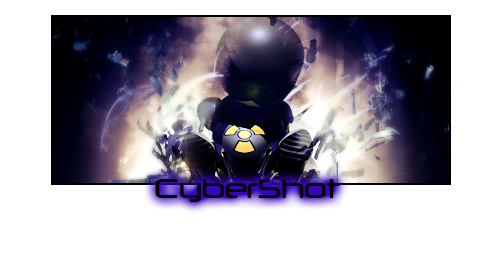
 Timeshift Timeshift
v1

v2

B/W

first in this year ... CnC?
Last edited by Marx911; 01-04-2009 at 11:41 AM.
-
the border sucks but thas an awesome sig. Perfect depth good blending and nice effects.
however the gradient coloring looks god awful drop that and dop solid coloring.
 My DevART
RATCHET is my bitch
Andrew says:
u ever stolen a bible?
Apathy says:
no
used the last two pages to roll a joint though
Andrew says:
wow
thats fucking hard core
^^HAHAHA, dm sucks XD
-
i like the style but i think it would look alot better if it was more dark
like maybe keep that light bit but make the rest a darker color
-
thx for comments ... damn you are fast 
added v2 and B/W
-
yeah i don't think it should be all black and white
i dunno just play around with blending options maybe black and white gradient map set to softlight
-
V2 for me i really dig this one the bg looks good there is good depth yet still some details in it, i for one like the coloring in the sig. And hey dont listen to papa about the border, ;D he just never learned how to love those cenima borders ;D have ya papa xD ? anyway i agree with him if he only saw the v1 cuz i dont like that white stroke under the kewl black cenima.
-
Similar Threads
-
By YaminoSoul in forum Sigs & Manips
Replies: 1
Last Post: 12-16-2008, 03:43 PM
-
By Anjiro in forum Sigs & Manips
Replies: 6
Last Post: 11-16-2008, 09:28 AM
-
By s0ggywaffls in forum Sigs & Manips
Replies: 10
Last Post: 11-10-2008, 06:39 AM
-
By Immortal. in forum Sigs & Manips
Replies: 6
Last Post: 06-27-2008, 12:07 PM
-
By csimao in forum Sigs & Manips
Replies: 2
Last Post: 01-31-2008, 08:35 AM
 Posting Permissions
- You may not post new threads
- You may not post replies
- You may not post attachments
- You may not edit your posts
-
Forum Rules
|


 Reply With Quote