0 members and 4,094 guests
No Members online

» Site Navigation

» Stats
Members: 35,443
Threads: 103,072
Posts: 826,684
Top Poster: cc.RadillacVIII (7,429)
|
-
-

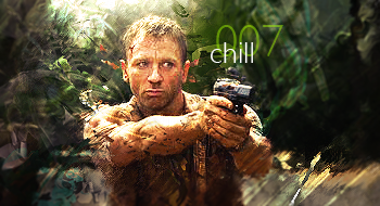
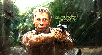
Ok I like the second one better, first off.
I don't really like the "chill" text but it's a better tagline then the other one.
Don't like the background motion blur streak things, they are too distracting.
Keep a few of the effects off of him, they are a bit overdone.
Good colour and the second one has darker edges which is good in my opinion.
To the left of his head, there is too much going on, it's way too chaotic and a bit oversharpened.
Some pretty good depth, but it's all obscured by all of those effects.
A pretty solid sig, it's just a bit too much, overwhelming even.
Good job, and it's good that you used a stock I haven't seen before.
Your not a whore!!! 
 Originally Posted by MarkPancake

MarkPancake banned.
Success.
Similar Threads
-
By Immortal. in forum Sigs & Manips
Replies: 8
Last Post: 12-20-2008, 11:59 AM
-
By Chunky in forum Resources
Replies: 5
Last Post: 12-07-2008, 02:53 PM
-
By Helix in forum Sigs & Manips
Replies: 1
Last Post: 11-23-2008, 06:06 PM
-
By Quaggy in forum Digital Art
Replies: 3
Last Post: 12-10-2007, 02:09 PM
-
By Daemon in forum Sigs & Manips
Replies: 11
Last Post: 07-22-2007, 05:13 PM
 Posting Permissions
- You may not post new threads
- You may not post replies
- You may not post attachments
- You may not edit your posts
-
Forum Rules
|


 Reply With Quote
