GFXVoid Graphic Design Forum

Remove Text Formatting
Loading...

» Online Users: 6,366

0 members and 6,366 guests
No Members online

» Site Navigation

 > FAQ

» Stats

Members: 35,443
Threads: 103,072
Posts: 826,684
Top Poster: cc.RadillacVIII (7,429)
Welcome to our newest member, Lekelindids
Results 1 to 6 of 6

Thread: PewpewLazers

  1. #1
    Join Date
    Jan 2008
    Location
    Cali
    Posts
    523

    Default PewpewLazers


    SUN-KEN-ROCK


    http://jayteare.deviantart.com/

    Cosmosys
    Intrinsic Nature will be back soon no worries.
    Gifts

  2. #2
    Join Date
    May 2008
    Location
    Good ol' Pennsylvania
    Posts
    893

    Default

    I like the second mate (kinda small tho), first I'm not sure, it's cool just not really feelin it I guess

    keep perfectin this style, looks good so far imo
    Last edited by Gallagher; 01-06-2009 at 08:50 AM.

  3. #3
    Join Date
    Jan 2008
    Location
    Cali
    Posts
    523

    Default

    thx, ive used alot of fx's on both of them most ly 2nd 1.

    SUN-KEN-ROCK


    http://jayteare.deviantart.com/

    Cosmosys
    Intrinsic Nature will be back soon no worries.
    Gifts

  4. #4
    Join Date
    Dec 2008
    Location
    Gujrat, India
    Posts
    1,926

    Default

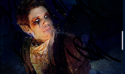
    umm notsurethe second one looks oversmudged, and the 1st one some spots coming here and there and then his jaw looks a bit more wider then his face lol
    still keepit up
    Fur's Gift BOOOO EVERYONE


    Apathy and i talk shit about everything.
    Kritez you have unyil yomottoe
    KidBuu is that latin?
    Kritez yes

    [DeviantART] [GrayMoon Studios]

  5. #5
    Join Date
    Mar 2008
    Location
    Mexico
    Posts
    391

    Default

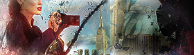
    too chaotic, over usage of effects so they filled over filtered. second one cutting the face in the middle breaks composition, colors are ok first one doesn't seem like a finished isg it looks like a WIP and no text feells inpersonal and doesnt feel like too much effort was put into these especially the first one i kidna dig the second one hmm interesting stuff needs work
    newest:

    Fav :


    The true and only Firescorpio!
    (no autographs please)


  6. #6
    Join Date
    Jan 2008
    Location
    Cali
    Posts
    523

    Default

    There is no smudgeing in both of theese sigs, nor filters. Thx for the comments. If i keep working on them, it would be to chaotic and ruin the quality. Also the 2nd 1 has insane amounts of brush blending, and image maniping. I like the 1st 1 alot because ive tried something called reverse layering ;p.

    SUN-KEN-ROCK


    http://jayteare.deviantart.com/

    Cosmosys
    Intrinsic Nature will be back soon no worries.
    Gifts

Posting Permissions

  • You may not post new threads
  • You may not post replies
  • You may not post attachments
  • You may not edit your posts
  •  
Powered by vBadvanced CMPS v4.1.1