0 members and 2,310 guests
No Members online

» Site Navigation

» Stats
Members: 35,443
Threads: 103,072
Posts: 826,684
Top Poster: cc.RadillacVIII (7,429)
|
-
 let it be let it be
let it be =P
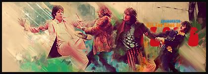
not much too say ive been working on some retro stuff for a while LP's and stuff will upload them soon (lp's)
and every time i finish a LP i feel like doing a sig of one significant band or musician from the 60's so so here is my beatles sig =P
hope you like it
newest:

Fav :

The true and only Firescorpio!
(no autographs please)
-
i like ur style scorpio (did i mention i m aa fan of you?). BTW that red head is over smudged. Pretty nice colors and flow, but it is looking a little yellowish .
Fur's Gift BOOOO EVERYONE

-
Wow, a bit crowded? Nice colours, not so sure about the text. 4/10
-
OH SNAP, IS THE SCORPIO GONNA TAKE THAT?! lol
I agree though, you did say it would be hard working with so many people in there man, and it apparently was... its very crowded. The text is nice though imo.
On the right side in a clipping mask i think i see a random floating knee... uh.. well.. are we missing a person? lol 
Love the background though, very nice feel to it!

Et Tu?
SilentShadow | Jorrne | Arcmenis | Garis | Splinter | Sanbu | DeadlesS | Tekken | Proflax | Suddu
-
-
It's nice looking, nothing particularly special, I've seen better from you.
Looks like it could have been just the LP sized down, if I'm not mistaken. 
Text is good, nice is the background works for a change.
Good colours, it's fresh and funky, but same old, same old.
Retro style works this time, but something new please!!!
 Originally Posted by MarkPancake

MarkPancake banned.
Success.
 Posting Permissions
- You may not post new threads
- You may not post replies
- You may not post attachments
- You may not edit your posts
-
Forum Rules
|


 Reply With Quote


