0 members and 2,662 guests
No Members online

» Site Navigation

» Stats
Members: 35,443
Threads: 103,072
Posts: 826,684
Top Poster: cc.RadillacVIII (7,429)
|
-
 obey your MASTER!!! obey your MASTER!!!
On I burn
Fuel is pumping engines
Burning hard, loose and clean
And on I burn
Churning my direction
Quench my thirst with gasoline
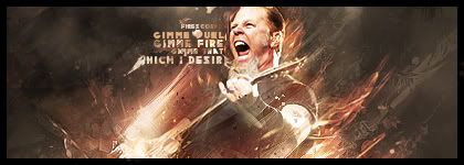
i was listening to the song when i felt lke doing a metallica sig, but previous experience with my beatles sig xD is hard and not very fruitfull to work with more than two focals.
So i decided to use James Hetfield for my sig, so here are my results
=P
Last edited by Firescorpio; 01-08-2009 at 04:36 PM.
newest:

Fav :

The true and only Firescorpio!
(no autographs please)
-
Seems a bit chaotic by his face erase some of the effects on his face and the sig will be pretty tight.
Also the text is a bit fail, you're trying to add too much in such a small place it looks crowded.
Otherwise good job el fuego.
P.s you suck at GH
-
I think the hecticness matches this sig very well, I mean jeeze, it's Metallica here, we're talking about a metal band lol, not some jazz band or something.
The text is a little crowded, otherwise this is a pretty rockin sig, great job.
-
I love chaotic work and thats just amazing but thistime i m not a fan of ur text, maybe wrong font
Fur's Gift BOOOO EVERYONE

-
-
Imo it would look better w/o a text but it's your call.
-
 Originally Posted by Ptka

Metallica!!! Love them! 
Awesome render, awesome effects.
Really good colours, not loving the text however, it's just too cramped in there.
The effects right below his chin look strange, that isn't a good place for effects, near the face.
Other than that, it's hot.
Write a tut, you have an awesome style and good technique that I would love to learn from.
hehe thnks for the CnC guys and as for the chin its his beard not effects =P
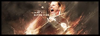
working on V2 with arranged text xD
edit
and here is the stock i used since few ppl have been asking for it
http://metallicabiography.com/resources/METALLICA26.jpg
V2:
i left that font because its the font used for my favorite album of metallica the black album so yeah xD not two ways around that =P
Last edited by Firescorpio; 01-09-2009 at 03:56 PM.
newest:
Fav :
The true and only Firescorpio!
(no autographs please)
-
Similar Threads
-
By 「Chai Child」 in forum Resources
Replies: 12
Last Post: 02-02-2009, 09:42 AM
-
By Studhorse in forum Sigs & Manips
Replies: 4
Last Post: 11-14-2008, 09:04 AM
-
By B in forum Sigs & Manips
Replies: 4
Last Post: 07-18-2008, 09:50 AM
-
By Graffight in forum Sigs & Manips
Replies: 5
Last Post: 05-14-2007, 09:25 AM
-
By _AcOlYtIc_ in forum Introductions
Replies: 5
Last Post: 05-02-2007, 10:35 PM
 Posting Permissions
- You may not post new threads
- You may not post replies
- You may not post attachments
- You may not edit your posts
-
Forum Rules
|


 Reply With Quote


