GFXVoid Graphic Design Forum

Remove Text Formatting
Loading...

» Online Users: 842

0 members and 842 guests
No Members online

» Site Navigation

 > FAQ

» Stats

Members: 35,443
Threads: 103,072
Posts: 826,684
Top Poster: cc.RadillacVIII (7,429)
Welcome to our newest member, Lekelindids
Page 1 of 2 12 LastLast
Results 1 to 10 of 11

Thread: Honour

  1. #1
    Join Date
    Feb 2008
    Location
    Toronto, Canada
    Posts
    4,831

    Default Honour


    bin a while since i did white BG
    and smudging usually looks good on that.
    trying to let go of my c4d addiction


  2. #2

    Default

    nice job man it may look better with some kind of board imo
    Illidan:

  3. #3
    Join Date
    Jul 2008
    Location
    Vancity, Canada
    Posts
    2,985

    Default

    It's pretty nice Immo, although the flow isn't great.
    That blue swerve on his arm ruins that section I think.
    Text is cool, just watch out for your smudging, it's a bit obvious, and I can see some of the circles that you used.
    Quote Originally Posted by MarkPancake View Post
    MarkPancake banned.
    Success.

  4. #4
    Join Date
    Jun 2008
    Location
    US of A
    Posts
    707

    Default

    What Ptka said, the smudging is nice but in some spots a bit obvious and the blue swerve ruins the left side.
    I feel like his arm should be blurred a bit to add depth, or at least burned.
    Text is nice but I don't know why you use those pixelated fonts for your name!! always! >.< it looks odd. The "immortal" font needs to change imo.
    Nice color choices though
    AGAINST PTKA: i like the flow... i see it.. idk..
    Again, large ass canvas for a siggeh.

    Et Tu?
    SilentShadow | Jorrne | Arcmenis | Garis | Splinter | Sanbu | DeadlesS | Tekken | Proflax | Suddu
    -


  5. #5
    Join Date
    Sep 2008
    Posts
    1,589

    Default

    I like white BGs. Your smudging is realy good and liking the splater effects they fit in well.

  6. #6
    Join Date
    Jan 2008
    Location
    Cali
    Posts
    523

    Default

    clean up the focal man

    SUN-KEN-ROCK


    http://jayteare.deviantart.com/

    Cosmosys
    Intrinsic Nature will be back soon no worries.
    Gifts

  7. #7
    Join Date
    Jan 2007
    Location
    Minnesota
    Posts
    5,091

    Default

    Quote Originally Posted by xJTRx View Post
    clean up the focal man
    ^^but the rest is hot. AMazing text dude that text goes really really well.


    My DevART
    RATCHET is my bitch
    Andrew says:
    u ever stolen a bible?
    Apathy says:
    no
    used the last two pages to roll a joint though
    Andrew says:
    wow
    thats fucking hard core
    ^^HAHAHA, dm sucks XD


  8. #8
    Join Date
    Jun 2008
    Location
    Missouri
    Posts
    137

    Default

    nice 
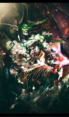
i like the colors and the text looks just perfect:P
    NEWEST


  9. #9
    Join Date
    Dec 2008
    Location
    Gujrat, India
    Posts
    1,926

    Default

    COOOOOOOOOOOOOOOOOOOOOOOOOOOOOOOOOOOL
    Fur's Gift BOOOO EVERYONE


    Apathy and i talk shit about everything.
    Kritez you have unyil yomottoe
    KidBuu is that latin?
    Kritez yes

    [DeviantART] [GrayMoon Studios]

  10. #10
    Join Date
    Oct 2007
    Posts
    2,782

    Default

    very hawt and text is win.


Similar Threads

  1. knight of honour
    By [Rogen] in forum Digital Art
    Replies: 2
    Last Post: 07-25-2005, 05:46 AM
  2. Medal Of Honour Allied Assualt
    By chOska in forum The Void
    Replies: 5
    Last Post: 06-03-2005, 12:04 PM

Posting Permissions

  • You may not post new threads
  • You may not post replies
  • You may not post attachments
  • You may not edit your posts
  •  
Powered by vBadvanced CMPS v4.1.1