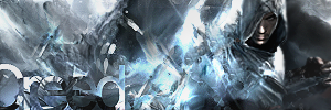
GFXVoid Graphic Design Forum

Remove Text Formatting
Loading...

» Online Users: 3,385

0 members and 3,385 guests
No Members online

» Site Navigation

 > FAQ

» Stats

Members: 35,443
Threads: 103,072
Posts: 826,684
Top Poster: cc.RadillacVIII (7,429)
Welcome to our newest member, Lekelindids
Results 1 to 4 of 4

Thread: HmmHmm

  1. #1
    Join Date
    Jan 2008
    Location
    Cali
    Posts
    523

    Default HmmHmm


    SUN-KEN-ROCK


    http://jayteare.deviantart.com/

    Cosmosys
    Intrinsic Nature will be back soon no worries.
    Gifts

  2. #2
    Join Date
    Dec 2008
    Location
    Gujrat, India
    Posts
    1,926

    Default

    was wonderin where u went lol.

    ok the creed one
    Luv the flow, like the bg but i cant properly see neither text nor the render.
    I think u made some other focal point coz if ur focal is the render its not looking like a focal.
    and ur idea to cr8 a clipping mask on text was nice but i ts not blending in its just making the tag look worse

    The second one
    No comments i just love it lol (oh i dint see there a text there)
    I just love the effects and the render is nicely blended, Umm maybe some more height with tag will do coz the right side is not looking good.

    GJ
    Fur's Gift BOOOO EVERYONE


    Apathy and i talk shit about everything.
    Kritez you have unyil yomottoe
    KidBuu is that latin?
    Kritez yes

    [DeviantART] [GrayMoon Studios]

  3. #3
    Join Date
    Jan 2008
    Location
    Cali
    Posts
    523

    Default

    thx everything was created by me and my smudgein ;p

    SUN-KEN-ROCK


    http://jayteare.deviantart.com/

    Cosmosys
    Intrinsic Nature will be back soon no worries.
    Gifts

  4. #4
    Join Date
    Sep 2008
    Posts
    1,589

    Default

    I like the effects and text on the first JTR

Posting Permissions

  • You may not post new threads
  • You may not post replies
  • You may not post attachments
  • You may not edit your posts
  •  
Powered by vBadvanced CMPS v4.1.1