0 members and 5,766 guests
No Members online

» Site Navigation

» Stats
Members: 35,443
Threads: 103,072
Posts: 826,684
Top Poster: cc.RadillacVIII (7,429)
|
-
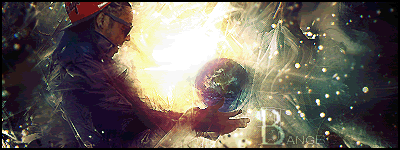
 constructive critisizme please constructive critisizme please
i posted a few sigs here a while ago,
since then i have done alot of sigs,
i would like to ask if some people
could give me some constructive
critisizme on a few please 
i would like to thank you in advance.

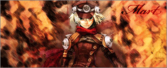
(^ the name mart is in there
since it was a request for someone)


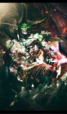
(also a request)
and the last

those were it, i would realy like
to improve my work so dont be
soft on critiszme :P
as for the texts i realize they all look a bit dull,
but im not quite sure how to realy improve them
any help on that would be greatly appreciated.
-
wow
i really like da last one
-
the mart, crush and last one are really cool gj.......the flames of hell one just looks like a image cropped...try adding some cd4's and fractals to them....2nd to last one its just a little to bright is all gj overall tho
-
They are pretty good need to work on your blending a little more tho and dont make the text so big takes away fromt he focal point
-
dragon one and flames of hell is pretty cool the rest i think just look too much distorted.
you need to work on you blending though.and try using sharpen coz most of ur tags are almost bblurry looking/.
Fur's Gift BOOOO EVERYONE

-
thanks for the advice given so far people.
il keep them all in mind and try it out.
things like this are realy helpfull ^^
-
The first one kills the eyes,I think too much contrast
Second one has bad text..Nice smudge though
In alll ur sigs"sparta " text is bad,If u wanna have like a watermark ,reduce the opacity....Anyways I think u'll imrpove quicklly!

Go GFX viod!
-
with ur text it is good to look at the text tutorials part of the site
i like ur current tag the bestlol
but i like ur last 1 its awsome
-
 Originally Posted by Suddu

The first one kills the eyes,I think too much contrast
Second one has bad text..Nice smudge though
In alll ur sigs"sparta " text is bad,If u wanna have like a watermark ,reduce the opacity....Anyways I think u'll imrpove quicklly!
tried lowering the contrast on the first one
real quick, and it does indeed look alot
better right away
Similar Threads
-
By ||.Falcons|Shifty in forum Sigs & Manips
Replies: 3
Last Post: 06-09-2008, 06:48 PM
-
By R4z3rsPar4d0x in forum Digital Art
Replies: 3
Last Post: 10-21-2006, 10:59 AM
-
By Rhage in forum Sigs & Manips
Replies: 3
Last Post: 10-14-2006, 09:08 AM
-
By Fort_of_Shadows in forum Digital Art
Replies: 6
Last Post: 01-23-2006, 11:41 AM
 Posting Permissions
- You may not post new threads
- You may not post replies
- You may not post attachments
- You may not edit your posts
-
Forum Rules
|


 Reply With Quote