GFXVoid Graphic Design Forum

Remove Text Formatting
Loading...

» Online Users: 3,624

0 members and 3,624 guests
No Members online

» Site Navigation

 > FAQ

» Stats

Members: 35,443
Threads: 103,072
Posts: 826,684
Top Poster: cc.RadillacVIII (7,429)
Welcome to our newest member, Lekelindids
Results 1 to 9 of 9

Thread: ahh lol

  1. #1
    Join Date
    Apr 2008
    Location
    Lisbon, PT
    Posts
    359

    Default ahh lol


  2. #2

    Default

    render could use some blending and text needs work other than that gj
    Illidan:

  3. #3
    Join Date
    Dec 2008
    Location
    Gujrat, India
    Posts
    1,926

    Default

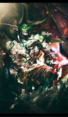
    The bg is abstract and matching the renderstyle. the bluish lift up is good at the btm and looks good tooo.t he text fits in. the render though pops out too much. A brush or 2 on him or just make the bluish lighting over the render.
    Fur's Gift BOOOO EVERYONE


    Apathy and i talk shit about everything.
    Kritez you have unyil yomottoe
    KidBuu is that latin?
    Kritez yes

    [DeviantART] [GrayMoon Studios]

  4. #4
    Join Date
    Sep 2008
    Posts
    1,589

    Default

    Realy like this Lew was not expecting it at all from the title.

    Nice work.

  5. #5
    Join Date
    Apr 2008
    Location
    Lisbon, PT
    Posts
    359

    Default

    a few changes.
    Lulz wing :3


  6. #6
    Join Date
    Dec 2008
    Location
    Gujrat, India
    Posts
    1,926

    Default

    wo! now he's avampire xD
    it looks better now. but i luved that bluish glow on top in the first tag
    Fur's Gift BOOOO EVERYONE


    Apathy and i talk shit about everything.
    Kritez you have unyil yomottoe
    KidBuu is that latin?
    Kritez yes

    [DeviantART] [GrayMoon Studios]

  7. #7
    Join Date
    Apr 2008
    Location
    Lisbon, PT
    Posts
    359

    Default

    Quote Originally Posted by KidBuu View Post
    wo! now he's avampire xD
    Correction : 1 winged angel.
    Play FFVII =]

  8. #8
    Join Date
    Jan 2007
    Location
    Minnesota
    Posts
    5,091

    Default

    IMO the first version was better. the color changes make it look like it was engulfed by the dreaded orange+purple gradient map. haha.

    I like it but it needs way more blending. And the compo is killing it. I think it'd be more interesting to the left.
    I'd really like to see you add like highlights in places to the bg in order of flow (smudging that is). i think it'd really set this off.


    My DevART
    RATCHET is my bitch
    Andrew says:
    u ever stolen a bible?
    Apathy says:
    no
    used the last two pages to roll a joint though
    Andrew says:
    wow
    thats fucking hard core
    ^^HAHAHA, dm sucks XD


  9. #9
    Join Date
    Jun 2008
    Location
    US of A
    Posts
    707

    Default

    What Papa said... blending is horrid, makes the render pop out like crazy. Try and duplicate it, blur the lower one and erase the edges of the top one with a soft brush on about 25% opacity maybe, and if that doesn't work try just erasing the edges of the original render with a soft brush on like 10% opacity at most, especially on the shoulders of the render

    other than that the effects in the bg are fantastic, nice work on the colors (v1, v2 i dont like as much), good work mangz

    Et Tu?
    SilentShadow | Jorrne | Arcmenis | Garis | Splinter | Sanbu | DeadlesS | Tekken | Proflax | Suddu
    -


Posting Permissions

  • You may not post new threads
  • You may not post replies
  • You may not post attachments
  • You may not edit your posts
  •  
Powered by vBadvanced CMPS v4.1.1