0 members and 305 guests
No Members online

» Site Navigation

» Stats
Members: 35,443
Threads: 103,072
Posts: 826,684
Top Poster: cc.RadillacVIII (7,429)
|
-
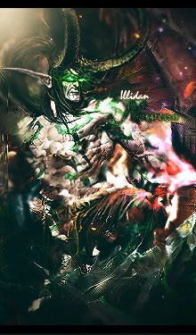
 Charge!! Charge!!
Newest, and as always feedback is welcome'd!

-
very good the only thing is that its hard to read the red text
-
text is horrid. I'd drop it or pick somethign else. the color/opacity is killing it.
Also why is the compo so off? Move the render to one side or the other.
this sig is pretty cool a bit boring though, and i don't see a ton of blending, even though i think it's all one stock, you still need it.
not bad.
 My DevART
RATCHET is my bitch
Andrew says:
u ever stolen a bible?
Apathy says:
no
used the last two pages to roll a joint though
Andrew says:
wow
thats fucking hard core
^^HAHAHA, dm sucks XD
-
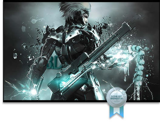
Not bad, the flags make it a bit dull.. it seems like the same effect repeated again and again and again and again and againnnnn
Text is ehh, change color/placement
lighting is off, seems like its coming from every which way
and like papa said compo = smack dab in the middlez, though i dont mind that as much :P

Et Tu?
SilentShadow | Jorrne | Arcmenis | Garis | Splinter | Sanbu | DeadlesS | Tekken | Proflax | Suddu
-
-
 Originally Posted by Papa

text is horrid. I'd drop it or pick somethign else. the color/opacity is killing it.
Also why is the compo so off? Move the render to one side or the other.
this sig is pretty cool a bit boring though, and i don't see a ton of blending, even though i think it's all one stock, you still need it.
not bad.
Yeah it is one stock, is it really bad? I mean bad as in if i use a stock for an entire signature?
-
its not bad to use a stock for an entire sig, what he means is (i think, im not papa, in case you didn't know) you still need to blend your focal, as in smudge/erase(if possible)/blur/overall BLEND with c4d's or other effects as you would in a sig with a normal render. for instance, the smudgish thing coming out of the B in the text and covering part of your focal is a form of blending the focal, though not the most subtle form of it. subtle is better in some places.
Et Tu?
SilentShadow | Jorrne | Arcmenis | Garis | Splinter | Sanbu | DeadlesS | Tekken | Proflax | Suddu
-
-
Ok, yeah whenever i use stocks i always smudge. Cause i dont want people to think i just found a stock and slapped my name on it. I added c4d, tried to blend and so forth. Original stock here ::
http://www.gamewallpapers.com/wallpa...7;3A+Total+War
Similar Threads
-
By Lewk in forum Sigs & Manips
Replies: 5
Last Post: 11-22-2008, 08:44 AM
-
By EMPeiTQ in forum The Void
Replies: 19
Last Post: 07-11-2005, 11:27 AM
 Posting Permissions
- You may not post new threads
- You may not post replies
- You may not post attachments
- You may not edit your posts
-
Forum Rules
|


 Reply With Quote