GFXVoid Graphic Design Forum

Remove Text Formatting
Loading...

» Online Users: 4,601

0 members and 4,601 guests
No Members online

» Site Navigation

 > FAQ

» Stats

Members: 35,443
Threads: 103,072
Posts: 826,684
Top Poster: cc.RadillacVIII (7,429)
Welcome to our newest member, Lekelindids
Results 1 to 4 of 4

Thread: naruto

  1. #1
    Join Date
    Mar 2005
    Location
    NYC
    Posts
    273

    Default

    What you guys think?


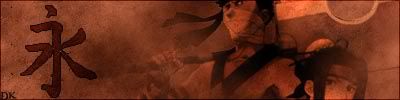
    btw that japanese (or was it chinese??) character is eternity

  2. #2
    Join Date
    Feb 2005
    Location
    Fort Wayne, Indiana
    Posts
    7,057

    Default

    It's alright. The colors are kinda ugly. The render is over blended. The bg is kinda boring. Try to fix those things up and see what you get.

  3. #3
    Join Date
    Feb 2005
    Location
    Land of DOOM MINES
    Posts
    951

    Default

    way to plain..render isn't blended to well...the symbol thingy looks really good though..nice job on that

  4. #4
    Join Date
    Feb 2005
    Location
    Somewhere..
    Posts
    444

    Default

    I think its kinda basic.. The whole sig is too plain mayb if u added some brushing u
    should have the render above the brushing and then feather it.
    Keep honking. I'm reloading.

Similar Threads

  1. new (Naruto) sig
    By blanes in forum Sigs & Manips
    Replies: 9
    Last Post: 09-30-2005, 09:59 PM
  2. Naruto sig
    By SloTh in forum Sigs & Manips
    Replies: 8
    Last Post: 02-27-2005, 04:48 AM

Posting Permissions

  • You may not post new threads
  • You may not post replies
  • You may not post attachments
  • You may not edit your posts
  •  
Powered by vBadvanced CMPS v4.1.1