0 members and 6,014 guests
No Members online

» Site Navigation

» Stats
Members: 35,443
Threads: 103,072
Posts: 826,684
Top Poster: cc.RadillacVIII (7,429)
|
-
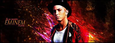
 Eminem Eminem
Hey guys, this is a new style to me and i havent done one in a while so go easy on me xD
Tbh, i dont like the text and i havent decided what i want to do with it yet, so i will
revisit this at a later date =]
Last edited by Fuzer; 02-25-2009 at 10:19 AM.
-
the render and the effects around it seem over sharpened, apart from that i like the range of colours and text is inventive, gj.
-
Yeah, i can see what you mean i didnt sharpen it so i dont know why it came out like that, ill see if i can change it up abit
-
k, also something to improve the text would be to make the eminem text a thicker font and then reduce the tracking of the text so the letters are closer together.
-
it does look over sharpened but it looks like u set to many things on color dodge maybe? maybe blend his back in alittle more other than that gj......text looks alittle boring also
-
love the effects, but the blending need works, The colors of the bg dont really fit all that much IMO, and like everyone else said it looks to sharp
-
yea well done its a bit bright but very colourful and yea text does need work.
Similar Threads
-
By Shadowz in forum Sigs & Manips
Replies: 2
Last Post: 05-30-2007, 10:05 PM
-
By Elephantastic' in forum Sigs & Manips
Replies: 3
Last Post: 02-25-2007, 07:07 AM
-
By Elephantastic' in forum Sigs & Manips
Replies: 2
Last Post: 01-20-2007, 04:42 PM
-
By .nemesis in forum Digital Art
Replies: 4
Last Post: 10-28-2005, 03:27 PM
-
By aplix in forum Support
Replies: 1
Last Post: 04-17-2005, 02:52 PM
 Posting Permissions
- You may not post new threads
- You may not post replies
- You may not post attachments
- You may not edit your posts
-
Forum Rules
|


 Reply With Quote