GFXVoid Graphic Design Forum

Remove Text Formatting
Loading...

» Online Users: 1,740

0 members and 1,740 guests
No Members online

» Site Navigation

 > FAQ

» Stats

Members: 35,443
Threads: 103,072
Posts: 826,684
Top Poster: cc.RadillacVIII (7,429)
Welcome to our newest member, Lekelindids
Results 1 to 2 of 2

Thread: Dj

  1. #1
    Join Date
    Feb 2009
    Location
    305
    Posts
    59

    Default Dj

    As you can see text is not my strong point CnC


    I Recent I


  2. #2
    Join Date
    Jul 2008
    Location
    Vancity, Canada
    Posts
    2,985

    Default

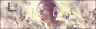
    You have to work on making all your sigs to as monotone.
    Meaning that the render stands out a bit more.
    The effects seem good, but you can't really see them because there is no depth.
    Try sharpening some of the things in the front, and blurring things in the back.
    The text is fine too, just work on picking fonts that work with the rest of the sig.
    Quote Originally Posted by MarkPancake View Post
    MarkPancake banned.
    Success.

Posting Permissions

  • You may not post new threads
  • You may not post replies
  • You may not post attachments
  • You may not edit your posts
  •  
Powered by vBadvanced CMPS v4.1.1