GFXVoid Graphic Design Forum

Remove Text Formatting
Loading...

» Online Users: 5,510

0 members and 5,510 guests
No Members online

» Site Navigation

 > FAQ

» Stats

Members: 35,443
Threads: 103,072
Posts: 826,684
Top Poster: cc.RadillacVIII (7,429)
Welcome to our newest member, Lekelindids
Results 1 to 10 of 10
  1. #1
    Join Date
    Jan 2009
    Location
    Scotland
    Posts
    2,772

    Question Blend In - first tag as iScribble.

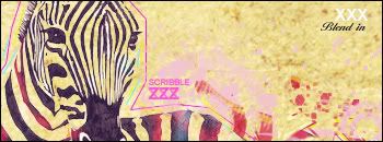
    Ok guys and girls let me know what you think I edited my zebra tag A LOT and i came up with this:


    i used yet another technique and thoroughly enjoyed creating it and i hope you like it.

    CnC as always is appreciated.
    Greets, Scribble.


  2. #2
    Join Date
    Jun 2008
    Location
    US of A
    Posts
    707

    Default

    Looks good man I love the zebra and the texture of the bg, the text is nice and I like the outlining of the zebra the text in the upper right seems out of place, maybe move it towards the other text or delete it altogether. Awesome work, keep it up

    Et Tu?
    SilentShadow | Jorrne | Arcmenis | Garis | Splinter | Sanbu | DeadlesS | Tekken | Proflax | Suddu
    -


  3. #3
    Join Date
    Jan 2009
    Location
    Scotland
    Posts
    2,772

    Default

    ty for the nice comment xD ill take it into account(btw ur guitar tag rocks!!!) xD

  4. #4
    Join Date
    Jan 2005
    Location
    USA
    Posts
    2,155

    Default

    i really like it. I like the stamp look and the dirty parchment paper feel.

    The only change I would make is get rid of the text. All of it. If you're going to put your name on it then make it in the same stamp kind of style as the zebra. The clean/crisp font takes away from the look.
    Resident father figure.

  5. #5
    Join Date
    Jan 2009
    Location
    Scotland
    Posts
    2,772

    Default

    hmmmm actually now i look at it ur right i think i will edit it

  6. #6
    Join Date
    Mar 2009
    Location
    Latvia
    Posts
    2,381

    Default

    aw i like the collors alot
    rly interesting , unique siganture


  7. #7
    Join Date
    Jan 2009
    Location
    Scotland
    Posts
    2,772

    Default

    ty glad u all like it

  8. #8
    Join Date
    Mar 2009
    Location
    Vancouver, Canada
    Posts
    51

    Default

    looks different but cool...the text in the right hand top corner caught my eye first....might want to get rid of it like 43 said


  9. #9
    Join Date
    Jan 2009
    Location
    Scotland
    Posts
    2,772

    Default

    yea ty man i think i will edit

  10. #10

    Default

    Not bad I like It, good work on it.


    Click and Register Please!

Similar Threads

  1. How to blend
    By Refresh in forum Support
    Replies: 14
    Last Post: 01-06-2006, 09:55 PM
  2. Does this blend
    By misterfootball247 in forum Digital Art
    Replies: 1
    Last Post: 07-24-2005, 04:19 PM
  3. My first blend..(?)
    By tbo in forum Digital Art
    Replies: 11
    Last Post: 01-25-2005, 07:20 PM

Posting Permissions

  • You may not post new threads
  • You may not post replies
  • You may not post attachments
  • You may not edit your posts
  •  
Powered by vBadvanced CMPS v4.1.1