0 members and 516 guests
No Members online

» Site Navigation

» Stats
Members: 35,443
Threads: 103,072
Posts: 826,684
Top Poster: cc.RadillacVIII (7,429)
|
-
 the Papa's Stock sig the Papa's Stock sig
well, courtesy of Papa, I'll be making a bunch of sigs with the same stock till i get one i deem kickass  so, here's the thread for em, C&C whichever ones you want, i have two so far, will update later so, here's the thread for em, C&C whichever ones you want, i have two so far, will update later 
v1: 
v2: 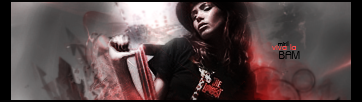
v3: 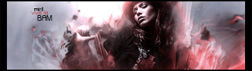
v4: 
Last edited by Miril; 03-18-2009 at 09:14 PM.
-
Ohh loving number 1! I like all the effects but I feel that the big wheel to the right of her has too strong a color. I know it sounds picky but that brown is darker then the rest of the sig and stands out alot more, maybe if you made it lighter or erased over it a bit, then it'd look hot. Text is sexy, V2 is too dark on the render imo. But anyways, sexy sig for #1 man, definite favourite. Such great depth
-
Love #1 as well, the light source is a lot better. I have the same nitpick as Splinter about the wheel, though.

WetWorks
[system]|DoubleForte|TheFallen|Funndoo|Dungus|Chidori|Ritz |Unit_Number_43|Demon4|Kallen
-
i like V1... but i think theres a little too much contrast in it...
-
thanks for the c&c - i'll edit them and start a 3rd

Et Tu?
SilentShadow | Jorrne | Arcmenis | Garis | Splinter | Sanbu | DeadlesS | Tekken | Proflax | Suddu
-
-
Too much? Orly? It's too much when it obscures the render, V1 has it just perfect.
WetWorks
[system]|DoubleForte|TheFallen|Funndoo|Dungus|Chidori|Ritz |Unit_Number_43|Demon4|Kallen
-
-
-
Update with V3 here and at the top:
did a lot of c4d work with this one, had problems blending and creating flow over on the right, but w/e >.< ill fix it with some C&C i hope
Last edited by Miril; 03-18-2009 at 09:14 PM.
Et Tu?
SilentShadow | Jorrne | Arcmenis | Garis | Splinter | Sanbu | DeadlesS | Tekken | Proflax | Suddu
-
-
v3 it is...
and DoubleForte.. yes too much... look at v1... look at her cheek and forehead.. it looks like theres some noise and her face is burnt... if u dont believe me try usin the burn tool a lot on a person's face... u'll get similar results... ok maybe not saturation.. maybe contrast.. i'm not sure which...
Similar Threads
-
By Papa in forum Signature Tutorials
Replies: 30
Last Post: 05-23-2010, 02:32 PM
-
By i.haveanidea in forum Resources
Replies: 15
Last Post: 03-30-2010, 08:57 PM
-
By Papa in forum Resources
Replies: 18
Last Post: 10-30-2008, 06:44 AM
-
By Papa in forum Resources
Replies: 17
Last Post: 08-21-2008, 09:18 AM
-
By Vel in forum Sigs & Manips
Replies: 4
Last Post: 08-17-2008, 12:35 PM
 Posting Permissions
- You may not post new threads
- You may not post replies
- You may not post attachments
- You may not edit your posts
-
Forum Rules
|


 Reply With Quote