0 members and 3,702 guests
No Members online

» Site Navigation

» Stats
Members: 35,443
Threads: 103,072
Posts: 826,684
Top Poster: cc.RadillacVIII (7,429)
|
-
-

1st one: I like it, but i think it would look better with some text, also maybe the colors should be more vibrant, but thats just me
2nd one: i like it better than the first, but theres alot of blank space on it, maybe center the focal+effects, and work on the sides.
Same deal with the text on the second one
Last edited by Fuzer; 03-29-2009 at 08:42 AM.
-
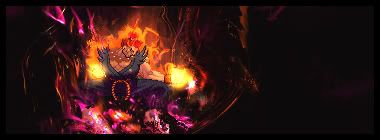
on the top sig the fire bit needs a bit of blending but the bg is amazing
My Newest
Making A Tutorial: Off Mail me if you wanna collaberate.
-
hehe text, i phail
i didnt want to overdo the effecta for the sprite
n ty SSSSK
-
well if you did little dark brushing or adding a dull c4d or something for the background of the sprite i think it would work, either way, i like them good job.
-
i agree, BG is sick! in the first.but you need to work on blending the render. Also try not to blur ALL of the BG it gives a bad DOF if only the focal is sharp.
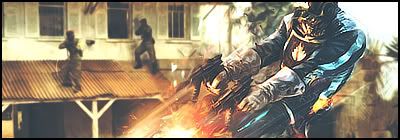
Second is decent but the sprite is a bit hard to pick out. Also the effects look LQ and it's wayy to dar around the edges.
 My DevART
RATCHET is my bitch
Andrew says:
u ever stolen a bible?
Apathy says:
no
used the last two pages to roll a joint though
Andrew says:
wow
thats fucking hard core
^^HAHAHA, dm sucks XD
Similar Threads
-
By ts_vike in forum Sigs & Manips
Replies: 8
Last Post: 03-13-2007, 08:53 PM
-
By SpartanX in forum Sigs & Manips
Replies: 4
Last Post: 03-09-2007, 05:11 PM
-
By .exploited in forum Digital Art
Replies: 6
Last Post: 04-03-2006, 08:09 PM
-
By imported_starcraft in forum Digital Art
Replies: 5
Last Post: 03-16-2006, 06:03 PM
-
By DeV in forum Digital Art
Replies: 2
Last Post: 06-20-2005, 06:16 AM
 Posting Permissions
- You may not post new threads
- You may not post replies
- You may not post attachments
- You may not edit your posts
-
Forum Rules
|


 Reply With Quote


