GFXVoid Graphic Design Forum

Remove Text Formatting
Loading...

» Online Users: 2,075

0 members and 2,075 guests
No Members online

» Site Navigation

 > FAQ

» Stats

Members: 35,443
Threads: 103,072
Posts: 826,684
Top Poster: cc.RadillacVIII (7,429)
Welcome to our newest member, Lekelindids
Results 1 to 3 of 3

Thread: This is pain =]

  1. #1
    Join Date
    Mar 2009
    Posts
    49

    Default This is pain =]

    hey guys new sig comment plz


  2. #2
    Fuzer is offline ◦○║►теαм ђаzέ™◄║○◦
    Join Date
    Feb 2009
    Location
    Aylesbury, England.
    Posts
    746

    Default

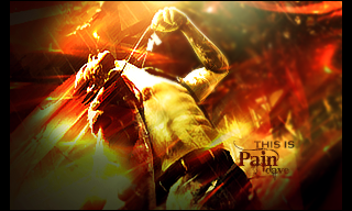
    Imo this would have been so much better if you hadnt used a soft black brush on softlight =/ + some of the effects look a little oversharpened, and the background it blurry! =[ text and lighting are both nice though

  3. #3
    Join Date
    Feb 2009
    Location
    Indiana, US
    Posts
    494

    Default

    Seems a bit chaotic. My eyes are going everywhere and not just centered on one defined focal. Also, it seems a bit overcontrasted. May be just me though. The text looks good though. Nice font choice.

    |Clicky > Forum Rules|

Similar Threads

  1. Pain
    By BonesMa in forum Sigs & Manips
    Replies: 4
    Last Post: 09-23-2008, 11:45 PM
  2. Take the pain away
    By Dark Designs in forum Digital Art
    Replies: 1
    Last Post: 10-17-2007, 06:26 PM
  3. pain
    By imported_starcraft in forum Digital Art
    Replies: 5
    Last Post: 09-21-2005, 03:48 AM
  4. The Pain
    By Tenchido in forum Sigs & Manips
    Replies: 25
    Last Post: 04-10-2005, 07:59 PM
  5. Pain
    By -Kanji- in forum Sigs & Manips
    Replies: 10
    Last Post: 03-19-2005, 03:27 PM

Posting Permissions

  • You may not post new threads
  • You may not post replies
  • You may not post attachments
  • You may not edit your posts
  •  
Powered by vBadvanced CMPS v4.1.1