0 members and 1,389 guests
No Members online

» Site Navigation

» Stats
Members: 35,443
Threads: 103,072
Posts: 826,684
Top Poster: cc.RadillacVIII (7,429)
|
-
-

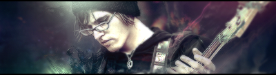
Definitely V1. Second is too monotone. On the first one, try to lighten up the left side a little bit. Try to bring out the colors a little more also. Looks good other than that.
-
v1. very nice render i like that
-
First one is by far the best.
Awesome light source, that is a really great effect.
A little empty on that right side, but it does have a statement the way it is.
Text isn't great, it's just too hard to read, make it legible, but subtle at the same time. 
 Originally Posted by MarkPancake

MarkPancake banned.
Success.
-
Originally Posted by iNova
Okay dokay,was working on some lighting stuff, and it looks okay to me.
V1:
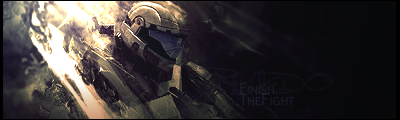
So far one of the best Ive seen on this site, the light source you have here is so good and you should go with that, as in continue to work with exactly what you've done here.
The Focal point is so strong on the shoulder/helmet that it almost gets our attention away from the negative right, almost. Which ISN'T a bad thing, If your going to leave a negative, never leave it an empty color, smudge some of the leftovers on it and use some displacement filters.
If you have any questions or want to learn something I just re-installed PS. And will be glad to answer your ? or anyone else's questions.
Your Very Own Professional Designer Right Here On The Void
---
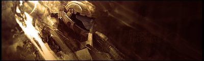
OLDEST WORK
Similar Threads
-
By DeadlyShadow in forum Sigs & Manips
Replies: 4
Last Post: 11-16-2008, 03:02 PM
-
By Papa in forum Sigs & Manips
Replies: 5
Last Post: 07-21-2007, 06:36 PM
-
By G-man in forum Digital Art
Replies: 2
Last Post: 07-19-2007, 09:23 AM
-
By TSM in forum Sigs & Manips
Replies: 5
Last Post: 06-17-2006, 01:46 PM
 Posting Permissions
- You may not post new threads
- You may not post replies
- You may not post attachments
- You may not edit your posts
-
Forum Rules
|


 Reply With Quote

