0 members and 3,301 guests
No Members online

» Site Navigation

» Stats
Members: 35,443
Threads: 103,072
Posts: 826,684
Top Poster: cc.RadillacVIII (7,429)
|
-
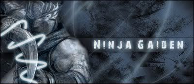
 Ninja Gaiden Ninja Gaiden
V1
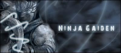
V2
anything I can do to improve this!?
Just Created it 
Last edited by navb01; 04-10-2009 at 06:23 PM.
Reason: new version
-
The light beam is a bit solid in brightness. It would look better if it was more of a thinner glow then the thick line.
Also, maybe some smudging around the character may go down well. 
-
I dont think I can change the thickness now of the glow but I lessened it and used the smudge and blur tool, just need to add a border!
-
-
Not a bad sig, I would lower the thickness of the pen tool line and also the glow on it because it draws far too much attention. I would however be fine it you added more of those around the sig, maybe a few C4D's to make the sig look a little more interesting
At the moment the sig looks kinda... just blue. The text fits with the background but i think you need to work more on how you go about making it show other than making it white and adding a glow effect. If you added more to the sig this would be easier to be honest because it give you more to work with.
Also as nav said - try and do something with the render to make it blend into the sig.
All these tips go towards a great looking sig - don't get me wrong though - it's not a bad sig, but with some work I can see it being rather good.
I'd recommend picking up a tutorial on smudge and maybe adding C4Ds.
Experiment with fonts too and work at adding more to the sig to add depth and make it interesting.
Sorry to seem to unload so much, it makes the sig seem bad - which is really isn't. Just all tips to add to it.
-
Well I really appreciate all the great feedback
im not really good at using c4d's so im not sure exactly how to make it look great, but thank you!
-
added a new version what do you all think?
is it better?
-
 Originally Posted by navb01

Well I really appreciate all the great feedback
im not really good at using c4d's so im not sure exactly how to make it look great, but thank you!
Don't be afraid to slap one on a sig and show us it... worst thing that can come of it is we tell you it doesn't look right - In which case we point you in another direction which hopefully works better for you... these is no right or wrong... only what looks better, everyone has different ideas
The second version is better in respects to the pen tool line.
I'd add a few more, experiment with adding them in different places? I'm not sure if blurring the background has really improved it as it still looks a little spacious.
-
hmmm okay i have to go to work right now but when I get home Ill mess around with it and see how it looks!
ill be sure to show you thanks for the feedback and help 
-
Anytime.
Any chance you could find a tut to make those other pen tool lines look more like... slashes? Might be a nice idea perhaps.
Similar Threads
-
By Quaggy in forum Sigs & Manips
Replies: 4
Last Post: 03-22-2008, 05:18 PM
-
By 'KroB in forum Sigs & Manips
Replies: 6
Last Post: 09-18-2007, 10:40 AM
-
By ilovecoheed in forum Sigs & Manips
Replies: 8
Last Post: 01-03-2006, 06:54 PM
-
By ANtidote in forum Sigs & Manips
Replies: 13
Last Post: 08-30-2005, 03:51 PM
-
By Spid3r in forum Digital Art
Replies: 8
Last Post: 07-11-2005, 02:38 PM
 Posting Permissions
- You may not post new threads
- You may not post replies
- You may not post attachments
- You may not edit your posts
-
Forum Rules
|


 Reply With Quote

