GFXVoid Graphic Design Forum

Remove Text Formatting
Loading...

» Online Users: 1,495

0 members and 1,495 guests
No Members online

» Site Navigation

 > FAQ

» Stats

Members: 35,443
Threads: 103,072
Posts: 826,684
Top Poster: cc.RadillacVIII (7,429)
Welcome to our newest member, Lekelindids
Results 1 to 7 of 7

Thread: New sig

  1. #1
    Join Date
    Mar 2009
    Posts
    49

    Default New sig

    Hey guys new sig CnC please


    Thanks .

  2. #2
    Join Date
    Apr 2009
    Location
    Manchester / Cheshire
    Posts
    406

    Default

    Like the effects, like the text and how you placed it.
    Lighting seems to work too.

  3. #3
    Join Date
    Jan 2009
    Location
    Leicester, UK
    Posts
    144

    Default

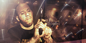
    Lighting is too bright for my liking
    Effects and Text are gud
    Wats dat thing on da bottom of right hand side its distracting
    Overall all its a nice sig


  4. #4
    Join Date
    Mar 2009
    Posts
    49

    Default

    tis a door i think lol cnt tell

  5. #5
    Join Date
    Nov 2008
    Location
    USA - New Hampshire
    Posts
    627

    Default

    text needs work... don't do a good sig and then slack on the text.. Its a bad habit to get into

  6. #6
    Join Date
    Mar 2009
    Posts
    49

    Default

    most ppl usually like my text =[ lol bt ill work on it =]

  7. #7
    Join Date
    May 2006
    Posts
    1,729

    Default

    You're gettng better.

    About the text, I think you just need to make it solid instead of transparent, and then pick appropriate colors. The partial transparency doesn't really work here.

Posting Permissions

  • You may not post new threads
  • You may not post replies
  • You may not post attachments
  • You may not edit your posts
  •  
Powered by vBadvanced CMPS v4.1.1