0 members and 1,387 guests
No Members online

» Site Navigation

» Stats
Members: 35,443
Threads: 103,072
Posts: 826,684
Top Poster: cc.RadillacVIII (7,429)
|
-
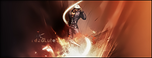
 Spiderman Spiderman
Just finished this;

V2(only difference is the height):

I'm happy about the text, but I think I messed up the flow.
CnC?
-
Mm.. I like the text and effects are decent, the spidey doesn't fit at all though imo.
-
Yes I agree with Bluice, the stock doesn't fit in with the background but apart from that the effects are good.
-
Wats wit ppl mkin spiderman sig -_-''
Yep agree above
Love the text and effect tho
Overall nice sig
-
omg i love it.
Colours are really nice, amazing composition. I personally think it fits.
Text is well placed....
Very impressed.
-
 Originally Posted by Kanariya

omg i love it.
Colours are really nice, amazing composition. I personally think it fits.
Text is well placed....
Very impressed.
agreed ^^
it does fit. i mean i see why ppl say it doesn't, but in this case, it does really work with the render. gj
favorite:
sotw:
 rrrrreLax.Designsssss
rezoLute
Originally Posted by Some guy off another forum...
I never said Fall Out Boy were emo, you tottering simpleton.
^i lawled^
-
overall I definitely like this sig! good job with effects and great job with the text!
-
text is nice but colors seem off to me.. try adding color to the render, as a thought...
-
I think it looks awsome, really nice work. Love the affects and the dark stock contrast.....
Similar Threads
-
By IiTz ShAnE in forum Sigs & Manips
Replies: 15
Last Post: 04-14-2009, 05:58 PM
-
By ghostbane in forum Digital Art
Replies: 3
Last Post: 03-19-2007, 11:20 PM
-
By Smiling Demon in forum Digital Art
Replies: 9
Last Post: 03-12-2007, 08:41 AM
-
By Side-FX in forum Digital Art
Replies: 0
Last Post: 02-23-2007, 09:01 AM
-
By Spid3r in forum Digital Art
Replies: 5
Last Post: 05-21-2006, 02:11 AM
 Posting Permissions
- You may not post new threads
- You may not post replies
- You may not post attachments
- You may not edit your posts
-
Forum Rules
|


 Reply With Quote