GFXVoid Graphic Design Forum

Remove Text Formatting
Loading...

» Online Users: 2,388

0 members and 2,388 guests
No Members online

» Site Navigation

 > FAQ

» Stats

Members: 35,443
Threads: 103,072
Posts: 826,684
Top Poster: cc.RadillacVIII (7,429)
Welcome to our newest member, Lekelindids
Page 1 of 2 12 LastLast
Results 1 to 10 of 12
  1. #1
    Join Date
    Nov 2008
    Location
    USA - New Hampshire
    Posts
    627

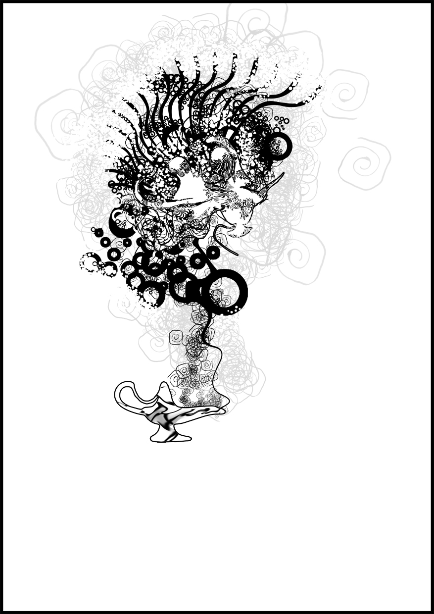
    Default Do you see what I see? Vector / Brushing

    http://helixdesigner.deviantart.com/...-see-119444471

    COMMENTS here or on DA are very appreciated!


  2. #2
    Join Date
    Sep 2008
    Location
    England
    Posts
    1,459

    Default

    It is a genis lamp right? Anyways i'm not too keen on this. Other then the fact it's simply black and white it just feels too messy imo.

  3. #3
    Join Date
    Jan 2009
    Location
    Scotland
    Posts
    2,772

    Default

    ITS AWSOME GREAT JOB DUDE

  4. #4
    Join Date
    Nov 2008
    Location
    USA - New Hampshire
    Posts
    627

    Default

    Quote Originally Posted by Splinter. View Post
    It is a genis lamp right? Anyways i'm not too keen on this. Other then the fact it's simply black and white it just feels too messy imo.
    Quote Originally Posted by iScribble. View Post
    ITS AWSOME GREAT JOB DUDE
    lol two very different opinions this is why design is hard :\

  5. #5
    Join Date
    May 2006
    Posts
    1,729

    Default

    The focal point area above the lamp looks very cool, but the lamp itself doesn't look nearly as good by comparison.

    The nearly transparent bit of background seems pretty unnecessary - I think it can probably be removed entirely.

    Nice job overall.

  6. #6
    Join Date
    Jun 2007
    Location
    Malaysia
    Posts
    568

    Default

    looks great except for the lamp which looks like.. liquid

  7. #7
    Join Date
    Sep 2008
    Location
    England
    Posts
    1,459

    Default

    Basically jorrne just said my opinion but with a better explanation :S

  8. #8
    Join Date
    Dec 2008
    Location
    Gujrat, India
    Posts
    1,926

    Default

    i actually love it. great job.
    i love those brushes u used nice job.
    the random shape its getting over the lamp looks cool too
    just there is a bit unnecessary white space below the lamp.
    Fur's Gift BOOOO EVERYONE


    Apathy and i talk shit about everything.
    Kritez you have unyil yomottoe
    KidBuu is that latin?
    Kritez yes

    [DeviantART] [GrayMoon Studios]

  9. #9
    Join Date
    Oct 2007
    Posts
    2,782

    Default

    Lamp looks odd.


    Rest looks nice. Took me ages to work out what it was though.


  10. #10
    Join Date
    Nov 2008
    Location
    USA - New Hampshire
    Posts
    627

    Default

    Quote Originally Posted by ratchetnclank View Post
    Lamp looks odd.


    Rest looks nice. Took me ages to work out what it was though.
    its nothing....

Similar Threads

  1. an almost no brushing sig
    By YellowSubmarine in forum Sigs & Manips
    Replies: 12
    Last Post: 12-15-2005, 12:46 AM
  2. only brushing
    By cloud260 in forum Digital Art
    Replies: 5
    Last Post: 11-27-2005, 12:37 AM
  3. [Video] Smooth Vector Shape Brushing
    By Push in forum Other Tutorials
    Replies: 8
    Last Post: 10-08-2005, 07:44 AM
  4. Brushing
    By f0xyl in forum Digital Art
    Replies: 7
    Last Post: 07-17-2005, 12:36 PM

Posting Permissions

  • You may not post new threads
  • You may not post replies
  • You may not post attachments
  • You may not edit your posts
  •  
Powered by vBadvanced CMPS v4.1.1