0 members and 3,677 guests
No Members online

» Site Navigation

» Stats
Members: 35,443
Threads: 103,072
Posts: 826,684
Top Poster: cc.RadillacVIII (7,429)
|
-
 House (yeah, another one of those) House (yeah, another one of those)
Ok ok, I know I'm being a total douche by posting for C&C and then not having the time to go C&C anyone else... lots of school stuffems to do but I had the time to do this (believe me the effect took fucking forever..)
I'll C&C others later.. I don't have much to do this weekend, but for now
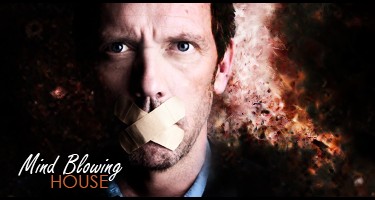
C&C please  I know the effects kind of in the wrong direction and the text is bad and its kinda plain, but man if you knew what was behind that single effect... I know the effects kind of in the wrong direction and the text is bad and its kinda plain, but man if you knew what was behind that single effect...

Et Tu?
SilentShadow | Jorrne | Arcmenis | Garis | Splinter | Sanbu | DeadlesS | Tekken | Proflax | Suddu
-
-
pretty cool. focal looks nice and clear. nice quality. effects are pretty decent. would look a lot better without the 'mind blowing' phrase imo.
-
I like it, and I disagree with Phayze... The "Mind Blowing" text looks good and is placed well, (I can't say much more about the text since I'm not that good at it myself...)
On the other hand I think perhaps you could try filling up a tiny bit the right side of the Focal, by Duplicating the Render and lowering Opacity...
Thumbs Up from me though! Good work!

- ~- Big Boss -~-

Latest
-
It looks good. Nothing much to say about it, the effects are good, and I've never watched house so I don't know how the phrase "Mind Blowing" fits into the sig. If it doesn't, then just change the phrase. The text blends in real good. Overall, it looks great! Nice job!

Adobe Photoshop - [CS4]
Editing since April '09

-
its very dark and the colours don't seem to fit very well. the text doesn't fit in my opinion.
But good job.
-
You gotta blend House in a little bit more, he pops out too much.
Good effects however I just don't think they are working well together.
Text is alright, I don't have any suggestions other than to play around a bit, but the larger text is working for this kind of sig. 
 Originally Posted by MarkPancake

MarkPancake banned.
Success.
-
I agree with Ptka.
I love the effects.
-
You're online! Wow... Anywhos, the effects are quite nice but the focal stands out way too much for me. Would've been better to maybe put some effects over the side of the render or something, anything to make it seem less obvious. I actually really like the text, I think the white color puts it down, but lowering the opacity may help. Other then all that, good job 
-
wow i love this. the text is awsome imo because its light ccolours and on a dark background. but i think the left side should have a few more effects to liven it up. it seems a bit boring other then the text.nice
-
ahaha thanks everyone, I'll edit it a bit
@ Splinter - CHYEAH I'M ONLINE BISH...op anyways.. lol umm yeah just online for a little right now, just woke up buut later I'm C&C'ing peoplez  lol lol
@ Ptka - NOOOOOOOOOOOOOO YOU CAN'T BE BORED OF PS!!! NOOOOOO
Everyone - Thanks for the C&C, love some of the sigss
Et Tu?
SilentShadow | Jorrne | Arcmenis | Garis | Splinter | Sanbu | DeadlesS | Tekken | Proflax | Suddu
-
Similar Threads
-
By K00L4ID in forum Sigs & Manips
Replies: 0
Last Post: 07-30-2008, 09:25 AM
-
By Henry in forum Digital Art
Replies: 11
Last Post: 04-20-2007, 04:05 PM
-
By Lonely_Shadow_Graphics in forum Introductions
Replies: 4
Last Post: 10-11-2006, 07:17 PM
-
By C K in forum Digital Art
Replies: 9
Last Post: 06-29-2005, 07:36 PM
-
By Hlynkinn in forum Sigs & Manips
Replies: 7
Last Post: 06-25-2005, 07:32 AM
 Posting Permissions
- You may not post new threads
- You may not post replies
- You may not post attachments
- You may not edit your posts
-
Forum Rules
|


 Reply With Quote


