0 members and 3,816 guests
No Members online

» Site Navigation

» Stats

Members: 35,443
Threads: 103,072
Posts: 826,684
Top Poster: cc.RadillacVIII (7,429)
|
-
 Recent Recent

Everything from scratch except the focal.

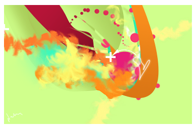
Everything from scratch.
-

bottoms ones a bit to big to be a sig. Top one its hard to even tell what it is..
:/
-

Abstract. 
I like both of them, the first one is good, but that motion blur doesn't have to be so blurred.
The bottom one is awesome, and the size is fine.
Colours are really cool, and all of those shapes made by scratch just make it better. :P
 Originally Posted by MarkPancake

MarkPancake banned.
Success.
-

Well thanks both.
I used wind Pt, I guess I will redo it anyway 
-

second one is great. nice job.
the wind doesn't work very well for the first, but it has some potential otherwise. looking forward to the redo.
-

Second one is great. The first one... well... Not to be mean, but I can't even tell what is going on. Looks low quality and not enough contrast. Not to mention the lines going across it. The bottom one is good though! Kudos on that one!
-

yeh man, the abstract is hot.
you overdid the wind a bit, the tag in unclear
-

The first one is a guy on a Motorbike.
I really like the second the colours look cool and it flows well.
remove the filtered wind on the first one and it would look alot better, if you want make a speed effect on the first it should flow more from the LR corner.
sublty use soemthing such as this to show the flow more
http://tinypic.com/view.php?pic=suvb7n&s=5
but this is your artwork and this is just my opinion.
Similar Threads
-
By GreyCub in forum Sigs & Manips
Replies: 2
Last Post: 04-25-2009, 09:16 PM
-
By ReBeL in forum Sigs & Manips
Replies: 7
Last Post: 07-05-2007, 09:53 AM
-
By MeanMarine in forum Digital Art
Replies: 4
Last Post: 10-07-2006, 08:02 AM
-
By Frozen in forum Sigs & Manips
Replies: 2
Last Post: 08-28-2006, 01:37 AM
-
By JMX in forum Digital Art
Replies: 11
Last Post: 01-31-2006, 05:40 AM
 Posting Permissions
- You may not post new threads
- You may not post replies
- You may not post attachments
- You may not edit your posts
-
Forum Rules
|

