GFXVoid Graphic Design Forum

Remove Text Formatting
Loading...

» Online Users: 3,758

0 members and 3,758 guests
No Members online

» Site Navigation

 > FAQ

» Stats

Members: 35,443
Threads: 103,072
Posts: 826,684
Top Poster: cc.RadillacVIII (7,429)
Welcome to our newest member, Lekelindids
Results 1 to 6 of 6

Thread: Superboy

  1. #1
    Join Date
    Mar 2009
    Location
    Denmark
    Posts
    21

    Default Superboy

    -My Best Signature-
    Sorry for my english im Danish!

  2. #2
    Fuzer is offline ◦○║►теαм ђаzέ™◄║○◦
    Join Date
    Feb 2009
    Location
    Aylesbury, England.
    Posts
    746

    Default

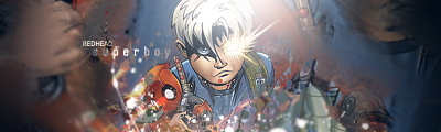
    i love it, my only critisms are that the bg looks abit TOO blurred, and im not fond of the clipping mask on the text, other than that, nice job, pretty good effects, could use a vibrant coloured c4d imo, but pretty good all the same, 8/10

  3. #3

    Default

    i agree with Fuz, the BG is too blurred and clipping masks are a bit messy.
    nice though, try avoiding using the soft brush lighting, its not soo good for depth.
    .:Latest:.
    Gifts:
    - [Groo] [-] [-] [-] -


  4. #4
    Join Date
    May 2005
    Location
    Netherlands | Eindhoven
    Posts
    808

    Default

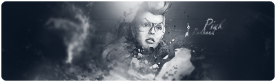
    I must say its not bad, It has nice depth because the foreground is kinda blurred and imo the bg isnt. you probably didnt do this on intent, but who knows? Im a fan of flares, so thats good. Only thing thats really disturbing me is the render.
    7

  5. #5
    Join Date
    Mar 2009
    Location
    Latvia
    Posts
    2,381

    Default

    borrder wouldnt hurt


  6. #6
    Join Date
    Apr 2008
    Location
    Sydney
    Posts
    293

    Default

    Yiew that's awesome. it is a bit too blurry at the bottom. plus i'm not a fan of using the render as the BG.


Posting Permissions

  • You may not post new threads
  • You may not post replies
  • You may not post attachments
  • You may not edit your posts
  •  
Powered by vBadvanced CMPS v4.1.1