0 members and 585 guests
No Members online

» Site Navigation

» Stats
Members: 35,443
Threads: 103,072
Posts: 826,684
Top Poster: cc.RadillacVIII (7,429)
|
-
 My fave!!! tut from ratchet i think :) My fave!!! tut from ratchet i think :)
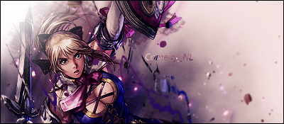 I like it very mcuh I like it very mcuh  but dont be nice, tell the truth! how is it? but dont be nice, tell the truth! how is it?
Recent Work:
TRANSFORMERSSSS!

 Mortal KOMBAAAT Mortal KOMBAAAT

-
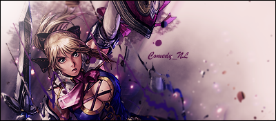
It's quite good, you have some GREAT depth and good blending.
A bit too bright in the corner, just tone down the light source a bit.
Text could use some work, I don't really like the font, but the clipping mask is fine.
Colours are great too, it's a pretty good sig. 
 Originally Posted by MarkPancake

MarkPancake banned.
Success.
-
-
Originally Posted by Ptka
It's quite good, you have some GREAT depth and good blending.
A bit too bright in the corner, just tone down the light source a bit.
Text could use some work, I don't really like the font, but the clipping mask is fine.
Colours are great too, it's a pretty good sig.
I agree with all of this. Especially the font although i'd remove the clipping mask
-
Yay! I was agreed with!
Oh and RnC, get on the IRC...NOW!
Originally Posted by MarkPancake
MarkPancake banned.
Success.
-
RENEW:
Recent Work:
TRANSFORMERSSSS!
Mortal KOMBAAAT
-
yeah... already bumping :$
Recent Work:
TRANSFORMERSSSS!
Mortal KOMBAAAT
Similar Threads
-
By Flip in forum The Void
Replies: 24
Last Post: 08-18-2006, 12:54 AM
-
By Blank_Canvas in forum The Void
Replies: 135
Last Post: 08-14-2006, 04:49 PM
-
By Dr D-Mento in forum Digital Art
Replies: 7
Last Post: 07-17-2005, 03:26 PM
-
By Marrklarr in forum Digital Art
Replies: 8
Last Post: 07-03-2005, 03:39 PM
 Posting Permissions
- You may not post new threads
- You may not post replies
- You may not post attachments
- You may not edit your posts
-
Forum Rules
|


 Reply With Quote


