0 members and 389 guests
No Members online

» Site Navigation

» Stats
Members: 35,443
Threads: 103,072
Posts: 826,684
Top Poster: cc.RadillacVIII (7,429)
|
-
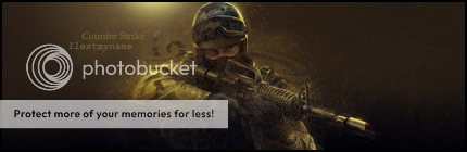
 Css Sig Css Sig
A sig themed on the game Counterstrike:source
C&C please:
-
background seems flat, maybe add some dept more colors and mess around with text!
dafont.com is great for fonts! check there
-
The effects around him are great, but the background is very flat and boring.
You need to add some depth, maybe try some more lighting or a C4D. 
 Originally Posted by MarkPancake

MarkPancake banned.
Success.
-
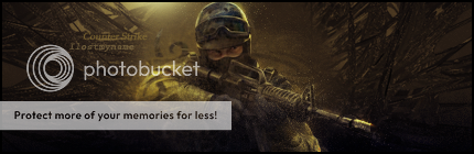
Added a C4D into the background
Better or worse?
-
sorry to bump, but i wanna know if with the C4D looks better or worse
-
To me, no it doesn't improve, at least not the right hand side, you might be able to get it to work on the left since it goes with the flow, at least in my opinion.
I'd start with reducing your canvas by at least 1/4-1/3 in width and offset the render some to either side of the center, then work from there.
You have created a nice ambient lighting feel to it to start, keep working on it and I think this one can be very nice.
-
 Posting Permissions
- You may not post new threads
- You may not post replies
- You may not post attachments
- You may not edit your posts
-
Forum Rules
|


 Reply With Quote


