0 members and 5,484 guests
No Members online

» Site Navigation

» Stats
Members: 35,443
Threads: 103,072
Posts: 826,684
Top Poster: cc.RadillacVIII (7,429)
|
-
 Bruce Lee Bruce Lee
CnC please? I'm still deciding on whether or not to enter it for SOTW. I don't know whether it's good enough.
I didn't add any C4Ds in, because you know, IT'S BRUCE LEE GUYS!!! Lol, sorry, bad joke. Anyway, I was kinda going for a classic simple sig kinda look.

V2-

V3-
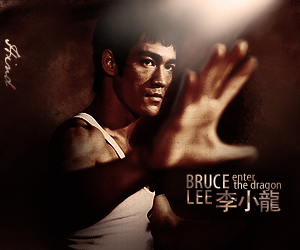
Stock I used- http://i134.photobucket.com/albums/q.../bruce-006.jpg
Last edited by Hind; 05-01-2009 at 10:18 AM.

Adobe Photoshop - [CS4]
Editing since April '09

-
You could've done better blurring to the hand. Also, in my opinion, I think the lighting is TOO strong. Nice attempt at depth though.
-
I've darkened the lighting a little. How does that look now? It was hard to find a good quality Bruce Lee stock and as you can see, the hand was already pretty badly blurred out in the stock. I just had to make the best out of what I had I guess.
Adobe Photoshop - [CS4]
Editing since April '09
-
Adobe Photoshop - [CS4]
Editing since April '09
-
Blending is pretty good, but lighting is still too strong.
There's also a kind of outer glow on the hand that's pretty distracting and I think the hand is a little too blurred.
I like the text but it might be a bit big.
-
Lighting is a little strong, i love the text and it has a good depth 
-
Thanks guys. Updated, I darkened the lighting a little, removed some light from his face, and made the light outline effect on his hand less strong. How is it now? And should I add a border?
Adobe Photoshop - [CS4]
Editing since April '09
-
To much light, and the hand looks bad. And where did the left hand go?
The text rocks
-
Lol thanks Rad, and you should take a look at the stock I used. I didn't have much choice but to blank out the left hand.
It would also explain why the right hand is blurred. I was gonna blur the hand even if it wasn't already blurred anyway. It's supposed to add some depth to the sig, so I guess it's alright.
Adobe Photoshop - [CS4]
Editing since April '09
-
not digging the size, try not loosing some of the original colour, its
monotone now. goodd job on the depth though.
Similar Threads
-
By MethodMan in forum Digital Art
Replies: 3
Last Post: 10-02-2007, 04:31 PM
-
By )85( in forum Digital Art
Replies: 8
Last Post: 06-06-2007, 06:35 PM
-
By Dale in forum Digital Art
Replies: 3
Last Post: 04-24-2007, 03:01 PM
-
By Sobek in forum Digital Art
Replies: 2
Last Post: 11-28-2005, 05:06 PM
-
By mOxmura in forum Sigs & Manips
Replies: 2
Last Post: 11-20-2005, 11:10 AM
 Posting Permissions
- You may not post new threads
- You may not post replies
- You may not post attachments
- You may not edit your posts
-
Forum Rules
|


 Reply With Quote


