GFXVoid Graphic Design Forum

Remove Text Formatting
Loading...

» Online Users: 5,509

0 members and 5,509 guests
No Members online

» Site Navigation

 > FAQ

» Stats

Members: 35,443
Threads: 103,072
Posts: 826,684
Top Poster: cc.RadillacVIII (7,429)
Welcome to our newest member, Lekelindids
Results 1 to 7 of 7

Thread: Creed

  1. #1

    Default Creed

    newest.


  2. #2

    Default

    Quote Originally Posted by Bluiceflamez View Post
    newest.
    Pretty nice but you should of blurred his right arm a bit.
    Favorite Tag


    Newest Tag
    (SotW)


  3. #3
    Join Date
    Mar 2008
    Location
    Whoa there buddy. I don't want you getting famous on dateline's to catch a predator.
    Posts
    21

    Default

    Right side feels a little wierd.
    The light source coming from the left throws off the lighting a bit.
    I like what you were going for though.

  4. #4
    Join Date
    Mar 2009
    Location
    Singapore
    Posts
    222

    Default

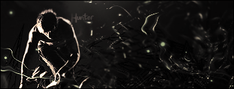
    I'm not feeling the flow here. Choice of colours is alright. Text a little small but I can see that it's in your style to make your text small and almost unreadable. Small text is cool, but not too small for your primary text.

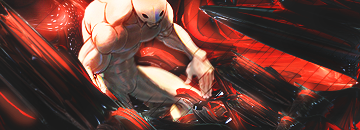
    Light source (or is it a C4D? lol) doesn't match with the brighter area on the render's right side. It's pretty obvious from the render that the light should be coming from the right side instead of left. Of course, you could always do some major editing but I'd change the position of the light source if I were you.
    Last edited by Hind; 05-02-2009 at 12:45 AM.


    Adobe Photoshop
    - [CS4]

    Editing since April '09


  5. #5
    Join Date
    Apr 2009
    Location
    AZ
    Posts
    659

    Default

    looks pretty good, text needs a bit of kerning looks scrunched!

  6. #6
    Join Date
    Apr 2009
    Location
    Somewhere in the Middle
    Posts
    467

    Default

    light source have on the right side as the render have, text too small can't read it, maybe its your style. im not really fan of the chosen color tho overall its a decent tag

  7. #7

    Default


    Fixed a little.
    Give more C&C I'll fix after my game.


Similar Threads

  1. Ryu tag and a Creed tag...
    By Harlequin_ in forum Sigs & Manips
    Replies: 3
    Last Post: 07-26-2008, 06:13 PM
  2. AC the creed xD!
    By Firescorpio in forum Sigs & Manips
    Replies: 6
    Last Post: 06-13-2008, 04:58 PM
  3. Assassin's creed
    By Raditz in forum Sigs & Manips
    Replies: 2
    Last Post: 05-18-2008, 10:17 PM
  4. Assassin's Creed
    By CyBeN in forum Sigs & Manips
    Replies: 7
    Last Post: 03-20-2008, 06:47 AM
  5. another creed
    By Arkanian in forum Sigs & Manips
    Replies: 6
    Last Post: 06-21-2006, 07:18 PM

Posting Permissions

  • You may not post new threads
  • You may not post replies
  • You may not post attachments
  • You may not edit your posts
  •  
Powered by vBadvanced CMPS v4.1.1