GFXVoid Graphic Design Forum

Remove Text Formatting
Loading...

» Online Users: 8,257

0 members and 8,257 guests
No Members online

» Site Navigation

 > FAQ

» Stats

Members: 35,443
Threads: 103,072
Posts: 826,684
Top Poster: cc.RadillacVIII (7,429)
Welcome to our newest member, Lekelindids
Results 1 to 3 of 3

Thread: Wolverine...

  1. #1

    Default Wolverine...


    How do you think I did?
    Favorite Tag


    Newest Tag
    (SotW)


  2. #2

    Default

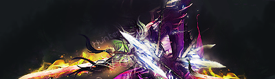
    try removing the linesin front of the tag, they are abit distracting,
    also your bg is too blurry only blur by a little bit like 0.3 on glassiun.
    its also a bit monotone. its better not puting the text than hiding it in the corner.
    other than that positioning is nice, good job.
    .:Latest:.
    Gifts:
    - [Groo] [-] [-] [-] -


  3. #3
    Join Date
    Sep 2008
    Location
    England
    Posts
    1,459

    Default

    I know you blurred to create depth but you've overdone it a bit. Looks like a big mess in the background now. Try sharpening it a tad. The effects themselves are cool although the lighting is really off imo. That light at the front is very distracting aswell.

Similar Threads

  1. Wolverine ]:)
    By Sinus in forum Sigs & Manips
    Replies: 2
    Last Post: 04-12-2008, 08:09 AM
  2. wolverine
    By jerry in forum Digital Art
    Replies: 7
    Last Post: 11-14-2005, 04:11 PM
  3. Wolverine
    By Floop in forum Digital Art
    Replies: 4
    Last Post: 10-23-2005, 11:15 PM
  4. Wolverine
    By projekt. in forum Digital Art
    Replies: 2
    Last Post: 10-22-2005, 08:47 PM
  5. wolverine!!!!!!!!!!!!!!!!!!!!!!!!!!!!!!!!!!!!!!
    By PP Bone in forum Digital Art
    Replies: 3
    Last Post: 10-15-2005, 03:40 AM

Posting Permissions

  • You may not post new threads
  • You may not post replies
  • You may not post attachments
  • You may not edit your posts
  •  
Powered by vBadvanced CMPS v4.1.1