0 members and 3,356 guests
No Members online

» Site Navigation

» Stats
Members: 35,443
Threads: 103,072
Posts: 826,684
Top Poster: cc.RadillacVIII (7,429)
|
-
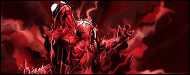
 Spiderman Spiderman
well, everyone has one. i didnt like my last one, made it long long time ago.
-
except that its too red its good
Fur's Gift BOOOO EVERYONE

-
I prefer red one.But like said too much red.Agree with that.
But I'm missing the text. :S
[LEFT] 
-
The red one!
Tone down the red and add black to the edges of the sign.
Looks a bit empty too, maybe ad some more effects
Erase the edges of the render to make it blend in better
-
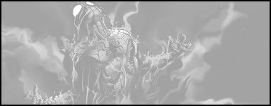
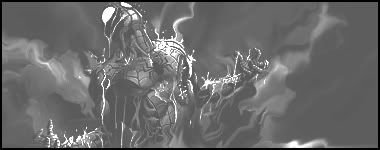
It's a bit too monotone imo. Perhaps when your smudging throw in some dark browns/reds to help with the coloring, otherwise though it's nice. Your smudgings improving well
-
I don't think he smudge at all. It just looks like c4d's who's rippled.
The rain on spidey who looks like smudge or clip mask is at the original render.
-
k thannks guys, for radillac, no C4d in these all smudge and smoe liquify.
i didnt focus much on the colour, wanted it to be BnW. ty for CnC. anyone else?
-
The red one is deffinantly the best, like others have said just tone it down a bit. Can I have the link to the render please? 
Last edited by Dom; 05-03-2009 at 02:36 PM.
-
just search spiderman in planet renders, it was a render not stock.
-
Nice job, I really love the red one.
Effects are awesome, but you could have used maybe one more colour, like a deep blue or a black.
Keep it clean like your others, don't add the text, I think it looks better raw. 
 Originally Posted by MarkPancake

MarkPancake banned.
Success.
Similar Threads
-
By Kievit in forum Sigs & Manips
Replies: 8
Last Post: 04-16-2009, 09:35 AM
-
By Smiling Demon in forum Sigs & Manips
Replies: 11
Last Post: 05-13-2007, 02:55 PM
-
By Chucks in forum The Void
Replies: 11
Last Post: 05-10-2007, 11:34 PM
-
By ghostbane in forum Digital Art
Replies: 3
Last Post: 03-19-2007, 11:20 PM
-
By Smiling Demon in forum Digital Art
Replies: 9
Last Post: 03-12-2007, 08:41 AM
 Posting Permissions
- You may not post new threads
- You may not post replies
- You may not post attachments
- You may not edit your posts
-
Forum Rules
|


 Reply With Quote


