0 members and 6,438 guests
No Members online

» Site Navigation

» Stats
Members: 35,443
Threads: 103,072
Posts: 826,684
Top Poster: cc.RadillacVIII (7,429)
|
-
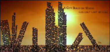
 City built on words City built on words
This took FOREVER. This is also my first typography sig. CnC?
-
i like it very much, great for your first typography 
only problem is that theres like a shadow of the building behind the text, it kinda ruins it for me. But if i ignore that it looks awesome 
-
Well, without the gradient maps behind the text it just looked like a block of text. So I threw in gradient fills to change that.
-
Looks a little like Solaris' sig in the previous round of the ongoing tournament. Lol!
Anyway, tbh, I'm not really liking it, even though I don't know much about typography, I do know that it's not appealing to my eyes. Concept not working for me.
Nice effort and creativity for a first attempt at typography though!
Last edited by Hind; 05-06-2009 at 01:01 PM.

Adobe Photoshop - [CS4]
Editing since April '09

-
yea i wood say change the outline and also the left building looks really weird i have seen this done before , could be improed a lot but awsome for ur first typography
-
This is great. Awesome concept, just needs some minor changes. Firstly, If I were you I'd take off the outline on the bottom and use text with a different color instead. Also, the buildings look good but minor changes can improve them alot. Add some little yellow letters for lights. Also the buildings are quite hard to make out (the collapsed ones) so if I were you I'd study real collapsed building pictures and try and replicate the view so it looks more obvious on first glance. Great job though, awesome concept and appealing. Just needs work
-
you should get rid of those overlaps where the ground meets the buildings - they're distracting. just cut the buildings off right before they meet the ground.
very cool concept.
-
Thanks guys. I'm going to do a little more work on it. (And splinter pointed out a typo. XD)
-
amazing concept with a few minor changes a masterpiece, well done
My Newest
Making A Tutorial: Off Mail me if you wanna collaberate.
Similar Threads
-
By qwasian in forum Digital Art
Replies: 1
Last Post: 10-19-2008, 11:44 AM
-
By Lumix in forum The Void
Replies: 214
Last Post: 07-17-2007, 07:16 PM
-
By Metal in forum The Void
Replies: 26
Last Post: 03-02-2006, 09:51 AM
-
By robgasm in forum Digital Art
Replies: 3
Last Post: 06-04-2005, 04:33 PM
-
By ROTD in forum The Void
Replies: 8
Last Post: 05-22-2005, 04:28 PM
 Posting Permissions
- You may not post new threads
- You may not post replies
- You may not post attachments
- You may not edit your posts
-
Forum Rules
|


 Reply With Quote


