0 members and 1,091 guests
No Members online

» Site Navigation

» Stats
Members: 35,443
Threads: 103,072
Posts: 826,684
Top Poster: cc.RadillacVIII (7,429)
|
-
 Mors Principium Est Sig - 2nd Sig Ever! Mors Principium Est Sig - 2nd Sig Ever!

C&C welcome!
-
You guys really know how to make a girl feel welcome.....
-
Hehe, we do 
Okay here are some pointers:
Dont use too big main text, especially not ones that look out of the ordinary. (sans-type is generally good). Try to stay away from using Borders at fonts as they arent "sharp" in PS.
Background is a bit too chaotic for my taste, as it has nothing infront. That means it has no depth at all.
some nice trick is to use something that is like a little bit ontop of the render so it has a bit more depth. Hmm, what more? Download some pre-made brushes if you're new to PS REALLY helps tons! Get some from deviantart or something, it rreally speeds up the process.
BUT! for a 2nd sig, this is pretty good! Rock on girl!
Last edited by Proflax; 05-17-2009 at 05:11 PM.
-
-
 Originally Posted by Proflax

Hehe, we do
Okay here are some pointers:
Dont use too big main text, especially not ones that look out of the ordinary. (sans-type is generally good). Try to stay away from using Borders at fonts as they arent "sharp" in PS.
Background is a bit too chaotic for my taste, as it has nothing infront. That means it has no depth at all.
some nice trick is to use something that is like a little bit ontop of the render so it has a bit more depth. Hmm, what more? Download some pre-made brushes if you're new to PS REALLY helps tons! Get some from deviantart or something, it rreally speeds up the process.
BUT! for a 2nd sig, this is pretty good! Rock on girl!
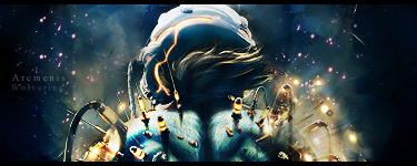
The background I made with custom brushes
As for the large font, that is the band's logo.......I can't change the font, but I could change the logo size.
As for the render, that was the only picture I could really use of the guy, and it was cut off to where he had to be backed against one side or the other.
What would you suggest putting on top of it to give it more depth?
-
Originally Posted by Arcmenis
for you sig, I know your starting out so to help you out I'll tell you what you should do.
First your background is the focal point here where your render should. Try and make the Render be more in the middle and make that your focal point
dont let it be overtaken by your background.
Also make sure that you have colors that go with your Render not just random colors thrown out there. Like that blue thats just sticking out like a sore thumb. And the text well I cant say much about text because Im not all that great at it either but for this sig its just way to big.
Your getting there and just keep practicing, Doing signatures with people is alot harder then with cartoon, or other type of renders. Keep reading those tuts and youll notice how good you'll get in no time.
As for your second post dont let it get to ya 
The render can't go centered.........the photo i used is exactly like that......that's all there is to it.
The text is actually a logo, and I could resize it.
-
the pointers are good help, pay attention to them, try using a smaller canvas, something like 500x150 or 420x120
Also never use gradients on text it makes the text look cheap, make the render or the stock the main part of the pic not the text.
My Newest
Making A Tutorial: Off Mail me if you wanna collaberate.
-
Please try not to double post, you can use the Edit button to change your previous posts! Thanks.
As for the sig, I can't add more CnC to the comments already made, just follow what they say and read some tut's. 
Originally Posted by MarkPancake
MarkPancake banned.
Success.
-
i have always and to this day still use www.good-tutorials.com
i have learned sooooo many things from that site, and dont be afraid to mess up your art, erasing or to undo something is as easy as 1 click,mess around with everything and i mean everything in photoshop
experiment with canvas sizes and fonts, that font in that sig doesnt fit right and the canvas to me is too big
just fool around with photoshop, its the best thing to do :P
In all deepest reality, we may only imagine the days past us, knowing that anything and all happens; and time will never be written until the happening... The future is 'eXcellence'.
eXx
 Posting Permissions
- You may not post new threads
- You may not post replies
- You may not post attachments
- You may not edit your posts
-
Forum Rules
|


 Reply With Quote