0 members and 5,556 guests
No Members online

» Site Navigation

» Stats
Members: 35,443
Threads: 103,072
Posts: 826,684
Top Poster: cc.RadillacVIII (7,429)
|
-
 Starcraft sig Starcraft sig
mi latest.
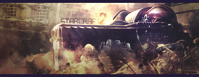
v2 (edited colors)
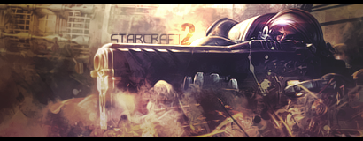
CnC please ;p
Last edited by Dron; 05-20-2009 at 10:47 AM.
-
Pretty nice! its your 3rd sig or something right?
Text looks fitting, Borders could still be black though And maybe try to give that "flames" in the front of the gun a bit more yellow ish color because its kinda bland now.
-
thanx mate ;p
in overall its not my 3rd, but its a 2nd sig im posting here, besides sigs i posted in introduction post :>
btw ive tried to make a yellows look more yellow, but i honestly didnt liked it that much, so i made them more magenta
-
Text is awesome.Really like it.
Colors are nice too, I should say.
Effects are decent too.
So, you're not so bad 
keep improving
-
thanx thanx, i will!
thats why im here ;p
-
I like it, think it's a pretty decent tag. Good blending, text is good. Keep it up!
-
great...lovely stuff.
love the feel to it.
i'd love a bit more contrast.
-
thanx mate
i reduced contrast on purpose, thought it will make it look more realistic? lol
gona experiment with it tommorow, since its a bit late for me already
-
looking pretty good man text is awesome makes the sig!
-
Nice job, the first thing I see is the shining text "2" and in this one, I think it's good.
The colours are great, maybe try sharpening the focal slightly though.
Great light source as well, would love to see a stock photo, to compare how much you added.
 Originally Posted by MarkPancake

MarkPancake banned.
Success.
Similar Threads
-
By Str0ngarm in forum Sigs & Manips
Replies: 2
Last Post: 05-22-2007, 03:26 AM
-
By Adam in forum The Void
Replies: 7
Last Post: 05-20-2007, 12:44 PM
-
By John in forum The Void
Replies: 7
Last Post: 04-30-2007, 09:32 PM
-
By Sobek in forum Digital Art
Replies: 5
Last Post: 12-19-2005, 04:05 AM
-
By JayD in forum The Void
Replies: 8
Last Post: 05-26-2005, 12:11 PM
 Posting Permissions
- You may not post new threads
- You may not post replies
- You may not post attachments
- You may not edit your posts
-
Forum Rules
|


 Reply With Quote


