GFXVoid Graphic Design Forum

Remove Text Formatting
Loading...

» Online Users: 1,986

0 members and 1,986 guests
No Members online

» Site Navigation

 > FAQ

» Stats

Members: 35,443
Threads: 103,072
Posts: 826,684
Top Poster: cc.RadillacVIII (7,429)
Welcome to our newest member, Lekelindids
Page 4 of 4 FirstFirst ... 234
Results 31 to 38 of 38

Thread: Ram's Portfolio

  1. #31
    Join Date
    May 2009
    Location
    always on top
    Posts
    42

    Default

    my first manip.


    very pleased with the result. C&C please.
    Latest:


    Favorite:


  2. #32
    Join Date
    May 2009
    Location
    always on top
    Posts
    42

    Default

    new Manipulation :

    orginal image:


    my manip:


    i have named this manip as Mother Earth.
    Latest:


    Favorite:


  3. #33
    Join Date
    May 2009
    Location
    always on top
    Posts
    42

    Default

    new PS drawing and coloring:


    i need some help....i want you guys to tell me ASAP what type of board it looks like? is it a snow board or a surfing board or should i add wheels and make it a skate board?
    Latest:


    Favorite:


  4. #34
    Join Date
    Jun 2009
    Posts
    10

    Default

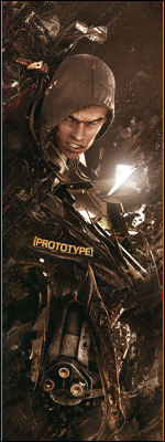
    Wow, these look really good. I really like the photographer one. It looks quite simple, but it does a good job. However, I feel the gradient on the text isn't needed. The Flash also looks great, but the render looks a tad too sharp near the head, love the font though. And the Crysis one, looks amazing! The blue color scheme is perfect and the text is also very good with it. Great job

  5. #35
    Join Date
    May 2009
    Location
    always on top
    Posts
    42

    Default

    i have completed the snowboard


    thanks warbacon.
    Latest:


    Favorite:


  6. #36
    Join Date
    Jun 2009
    Posts
    14

    Default

    TYou've deffinately imprved, i'm going to be getting something similar done.
    Will update once i start making sigs

  7. #37
    Join Date
    Jun 2009
    Posts
    30

    Default

    your style has diffenitly gotten better over the months nice work


  8. #38
    Join Date
    Mar 2009
    Location
    Gabriola Island
    Posts
    394

    Default

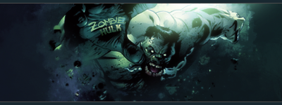
    I was going to suggest that your board is a skimboard. I love your dark knight and crysis sigs, the gengar one as well. Great stuff!


    WetWorks
    [system]|DoubleForte|TheFallen|Funndoo|Dungus|Chidori|Ritz |Unit_Number_43|Demon4|Kallen

Similar Threads

  1. My GFX portfolio.
    By Fre§h in forum Sigs & Manips
    Replies: 3
    Last Post: 12-29-2008, 08:56 PM
  2. Portfolio
    By Ben in forum Digital Art
    Replies: 8
    Last Post: 02-28-2006, 05:23 PM
  3. Portfolio
    By ap3xual in forum Digital Art
    Replies: 2
    Last Post: 10-01-2005, 11:55 PM
  4. portfolio
    By Tw1tcH in forum Digital Art
    Replies: 8
    Last Post: 08-03-2005, 11:28 AM
  5. my portfolio
    By chOska in forum Support
    Replies: 0
    Last Post: 05-13-2005, 08:37 PM

Posting Permissions

  • You may not post new threads
  • You may not post replies
  • You may not post attachments
  • You may not edit your posts
  •  
Powered by vBadvanced CMPS v4.1.1