0 members and 375 guests
No Members online

» Site Navigation

» Stats
Members: 35,443
Threads: 103,072
Posts: 826,684
Top Poster: cc.RadillacVIII (7,429)
|
-

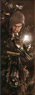
I also really like the Crysis one; I like them both to be honest. Your good with those Pokemon ones! Blending and the colours. On the Crysis one I would crop the right side as it looks too plain after the text. Keep it up! 
-
-
No worries mate; always happy to give my honest opinion on peoples work.
-
 Originally Posted by funndoo

use simple fonts such as arial,verdana,tahoma and make them smaller
I disagree with this. Not because legacy fonts are a bad choice, but because the work you have here (thread author) has some good consistency as far as typo goes. You should always work to find a common medium with the theme of the artwork and the type of font you use.
As far as I am concerned, you've done well. I like the wide variety of font faces, and most of them are well placed (hard to say because sigs are so small in size, so it's limiting where you can place the text), legible, and fit the overall theme of the piece. They don't seem overused, or awkward. One thing I would recommend, is taking into consideration the art directions that you might or might not be considering. Text should not be in the way of a piece. IE if the stock you are using is looking to the left, the left should be open, to give the piece motion. Text in the way disrupts that flow, but if thats what you intend, then there you go.
The cliche that you should stick to default fonts sounds alot like what people who are web safe font zealots would say. I say choose a font that you think suits the piece. Using defaults for every piece is bland, unoriginal, and it takes away from your typo. If you want to stand out, put that much more effort into how you brand it, the way you add text. Text is just as important, if not more important than the piece itself. I say this because oftentimes, some designers rely on the typography to define the meaning of the piece. And if the typo doesn't fit...well, the piece is ruined.
Stick with what you're doing, originality is nothing you want to lose any time soon.
Last edited by Chris; 05-29-2009 at 12:20 PM.
-
Of course it's not Solar but if text is a struggle you should always stick to default fonts until you feel confident with what text your placing. You can't just place a cool font that has nothing to do with the image. :s
-
Originally Posted by dccarnage
Of course it's not Solar but if text is a struggle you should always stick to default fonts until you feel confident with what text your placing. You can't just place a cool font that has nothing to do with the image. :s
I never said you should. I get what you're saying, but my point hopefully is clear. You shouldn't limit yourself to what fonts you can use for any reason. You will only learn the nuances of typography by diving in headfirst. Sticking with the basics (and I don't interpret the default fonts as being the basics) will hurt you in the long run. It's all a matter of understanding how typography makes or breaks a piece, and unless you study it as a seperate entity, it's going to be difficult to see it that way.
I'm not bumping either theory, but it's a good idea to spend some quality time learning what's at your disposal.
-
Yeah, I see what your saying. But hey, we all have different ways of introducing new things and experimenting.
-
as far as fonts are concerned i generally use fixed width fonts. my personal favorite is "Secret Code".
Latest:

Favorite:
-
-
the pokemon sigs youre making arae awesome. love the gengar one <3 purple

XBL GT: iTz DoCiLe < add me if you play halo or just wanna be a boss !
Similar Threads
-
By Fre§h in forum Sigs & Manips
Replies: 3
Last Post: 12-29-2008, 08:56 PM
-
By Ben in forum Digital Art
Replies: 8
Last Post: 02-28-2006, 05:23 PM
-
By ap3xual in forum Digital Art
Replies: 2
Last Post: 10-01-2005, 11:55 PM
-
By Tw1tcH in forum Digital Art
Replies: 8
Last Post: 08-03-2005, 11:28 AM
-
By chOska in forum Support
Replies: 0
Last Post: 05-13-2005, 08:37 PM
 Posting Permissions
- You may not post new threads
- You may not post replies
- You may not post attachments
- You may not edit your posts
-
Forum Rules
|


 Reply With Quote