0 members and 867 guests
No Members online

» Site Navigation

» Stats
Members: 35,443
Threads: 103,072
Posts: 826,684
Top Poster: cc.RadillacVIII (7,429)
|
-
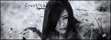
 restless restless
New one!
C&C pwease  idk about this one but... hmmm... well anyways. idk about this one but... hmmm... well anyways.

Et Tu?
SilentShadow | Jorrne | Arcmenis | Garis | Splinter | Sanbu | DeadlesS | Tekken | Proflax | Suddu
-
-
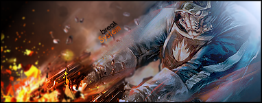
this is fresh man. effects and colors could be more vibrant and interesting but its cool, expand on this style ;o
-
thanks splinter  haha i sorta took out all the vibrant colors... hmm.. :\ haha i sorta took out all the vibrant colors... hmm.. :\
Et Tu?
SilentShadow | Jorrne | Arcmenis | Garis | Splinter | Sanbu | DeadlesS | Tekken | Proflax | Suddu
-
-
Dawg, love it. Cept for the wing....
Threw me off. Not blended enough man 
Seriously. God, it's a great piece but get rid of that wind or make it less visible
Synsational: "I got so many products in my hair that your Anus hair would probably smooth out too. You'd end up getting a job modeling ass hair for Tres Emme."
-
the what? its all c4d/displacements/filters
Et Tu?
SilentShadow | Jorrne | Arcmenis | Garis | Splinter | Sanbu | DeadlesS | Tekken | Proflax | Suddu
-
-
idk about the effect in the left, maybe i just dont like that style that much  also i wouldnt sharpen this sig that much also i wouldnt sharpen this sig that much
colors are realistic and fine imo, i also like the lightining, text would look nice but is oversharpened as whole sig
-
th wing effect nice except just before her shoulder looks like slight hiccupbut i do love ur style any tuts?
-
v2 blurred and tried to blend a bit more:

ive only ever made one tut aha but they're fun to make
thanks for the C&C
Et Tu?
SilentShadow | Jorrne | Arcmenis | Garis | Splinter | Sanbu | DeadlesS | Tekken | Proflax | Suddu
-
-
looks way better, though i would remove some blur over her face and below, to make her stand out a bit more to create some depth, but im not sure about that, guess its ok
-
It's looking really good, got a great flow, hope you expand on this style some more.
Similar Threads
-
By +mw.kira in forum Digital Art
Replies: 0
Last Post: 03-31-2008, 07:21 AM
-
By S-F in forum Digital Art
Replies: 9
Last Post: 11-15-2005, 11:33 AM
 Posting Permissions
- You may not post new threads
- You may not post replies
- You may not post attachments
- You may not edit your posts
-
Forum Rules
|


 Reply With Quote
![[system]'s Avatar](image.php?s=6bc3275991ae807b0f8dc93b32b476b0&u=21561&dateline=1231635610)