0 members and 1,998 guests
No Members online

» Site Navigation

» Stats
Members: 35,443
Threads: 103,072
Posts: 826,684
Top Poster: cc.RadillacVIII (7,429)
|
-
-

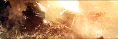
It refuses to show up for me D:

WetWorks
[system]|DoubleForte|TheFallen|Funndoo|Dungus|Chidori|Ritz |Unit_Number_43|Demon4|Kallen
-
Uh thats probably my shitty uploading skills, i'll re-upload it
"Imagination Is More Important Than Knowledge"
Latest

Favourite
 "Together We Stand Strong"
-
-
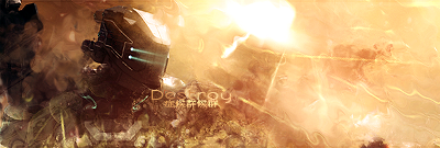
i really like this style, nice signs mate
-
My god that's the sex. Well done!
WetWorks
[system]|DoubleForte|TheFallen|Funndoo|Dungus|Chidori|Ritz |Unit_Number_43|Demon4|Kallen
-
looks really good nova =D
My Latest Work:
-
the smudging is a tad messy but it suits it in a way. All i wood say is make the text a little more visible and clean up the smudging on the left of the render.
-
not bad man, love the effects, the lighting is a tad bright, try making the lighting more like your halo tag lighting on the bright part, it looks sick tho.
-
make the render slightly move visible and use a 3-7 soft brush in blue on a new layer and do two dots where the eyes are and set to screen or lighten, it will being the eyes out a lot more
My Newest
Making A Tutorial: Off Mail me if you wanna collaberate.
Similar Threads
-
By Immortal. in forum Sigs & Manips
Replies: 12
Last Post: 03-17-2009, 09:22 PM
-
By Afterburn in forum The Void
Replies: 1
Last Post: 10-24-2006, 09:34 AM
-
By imported_ersen in forum Digital Art
Replies: 7
Last Post: 12-23-2005, 11:24 PM
-
By Roy in forum Sigs & Manips
Replies: 3
Last Post: 11-19-2005, 04:03 PM
 Posting Permissions
- You may not post new threads
- You may not post replies
- You may not post attachments
- You may not edit your posts
-
Forum Rules
|


 Reply With Quote